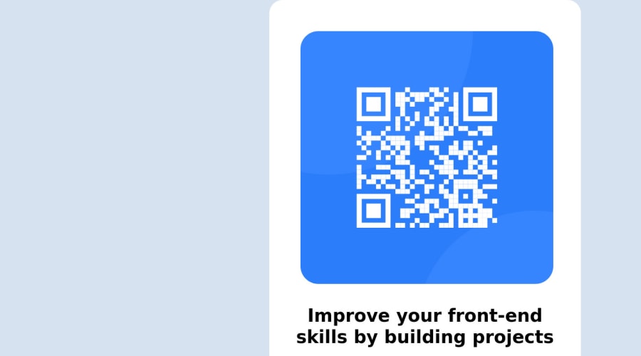
Design comparison
Solution retrospective
- How can I make sure that the DIV is centered regardless of the computer screen size?
- Is there a way to make the website responsive with only one line of code instead of individually specifying each screen size within the code?
Community feedback
- @remmjiPosted over 1 year ago
Hello 👋
There are few simple ways to center a div:
💡Flex:
.container {
  display: flex;
  justify-content: center;
  align-items: center;
  height: 100vh;
}
💡Grid:
.container {
  display: grid;
  place-items: center;
  height: 100vh;
}
💡Positioning:
div {
  position: absolute;
  top: 50%;
  left: 50%;
  transform: translate(-50%, -50%);
}
In regards to your second question. Flexible layouts like Flexbox and CSS Grid can make it easier to create responsive designs that work well on different screen sizes and devices. Using relative units like vw, vh, and % instead of absolute units like px or em can also help ensure that your designs remain responsive.
Additionally, it's important to keep in mind that HTML is designed to be responsive by default. When building a website or application, it's our responsibility as developers to ensure that our code and styles support and enhance this responsiveness, rather than hindering it. By using the appropriate units and layouts, we can build designs that are flexible and adapt to different screen sizes, rather than being rigid and difficult to use on smaller screens.
Hope those tips will help you :)
Marked as helpful3 - @ecemgoPosted over 1 year ago
Some recommendations regarding your code that could be of interest to you.
CSS
In order to center the card correctly
- You'd better remove
height: 100%from thehtml
html { /* height: 100%; */ }- After removing it, you need to set the width of the card, so you can give the
max-width: 320pxto the.main-container. - In this way, the card will be smaller and responsive, so you don't use media query for this solution. You can remove the media queries from the CSS:
.main-container { /* width: 100%; */ /* max-width: 600px; */ max-width: 320px; /* padding: 50px; */ padding: 20px; }- In order to adjust the image, you'd better use
width: 100%;,height: 100%;anddisplay: block - After fixing, you don't need `.image``, you can remove it
img { /* border-radius: 50px; */ /* margin-right: 2%; */ /* padding: 10px; */ width: 100%; height: 100%; display: block; border-radius: 20px; } /* .image { display: flex; justify-content: center; align-content: center; padding: 10px; display: block; width: 100%; } */- Finally, if you adjust the
font-sizeof.front-endandp, the text will be better:
.front-end {
  /* font-size: 40px; */
  font-size: 25px;
  text-align: center;
}
p { /* font-size: 25px; */ font-size: 16px; }Hope I am helpful. :)
Marked as helpful0 - You'd better remove
- @ThatDevDiazPosted over 1 year ago
Hey!
When working with projects, always make sure in these kind of situations to utilize 100% of the viewport. The viewport is the entirety of the screen/page.
You wanna set the viewport to 100% by using :
body { height: 100vh; }
There's other ways to do this as well, this is just one way. Once the viewport height is set to 100%, then you want to create a container within the body. This container can then be set as a flexbox to be centered within the body.
Without a set viewport height/width, the container or elements inside the body do not know any boundaries.
Example :
html, body { height: 100%; }
body { display: flex; justify-content: center; align-items: center; margin: auto; }
.container { /* add your container styles here */ }
Hope this helps!
Marked as helpful0
Please log in to post a comment
Log in with GitHubJoin our Discord community
Join thousands of Frontend Mentor community members taking the challenges, sharing resources, helping each other, and chatting about all things front-end!
Join our Discord
