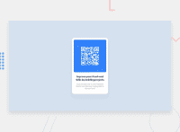
Design comparison
Solution retrospective
Hi everyone this is my solution for QR code component.It was very quick challenge, let me know if somethings went wrogn in my solution.
Community feedback
- @AdrianoEscarabotePosted almost 2 years ago
Hello Carlos Augusto Prado, how are you? I truly loved your project's outcome, however I have some advice that I hope you'll find useful:
To improve the responsiveness of the project, we can make some changes:
.component {
    max-width: 32rem;
}
.component img {
    width: 100%;
    max-width: 28.8rem;
    height: auto;
}
Add a padding to the body, so that the content in lower resolutions doesn't hit the edge of the screen!
The remainder is excellent.
I hope it's useful. 👍
Marked as helpful0 - @joaskrPosted almost 2 years ago
Hi kml, your solution looks great! I have 2 very small suggestions to make it even better:
- You are currently using <p> for "Improve your front-end skills by building projects" text. Changing it to <h1> will fix the accessibility issue :)
- I can see that you thought about responsiveness - that's great. However I see that the layout is a little bit broken on mobile when it's rotated horizontally. You might want to fix that. Overall - great job :D
Marked as helpful0@kmlsonPosted almost 2 years ago@joaskr thanks for your suggestions. I made a few change I hope the layout is not broken anymore
0
Please log in to post a comment
Log in with GitHubJoin our Discord community
Join thousands of Frontend Mentor community members taking the challenges, sharing resources, helping each other, and chatting about all things front-end!
Join our Discord

