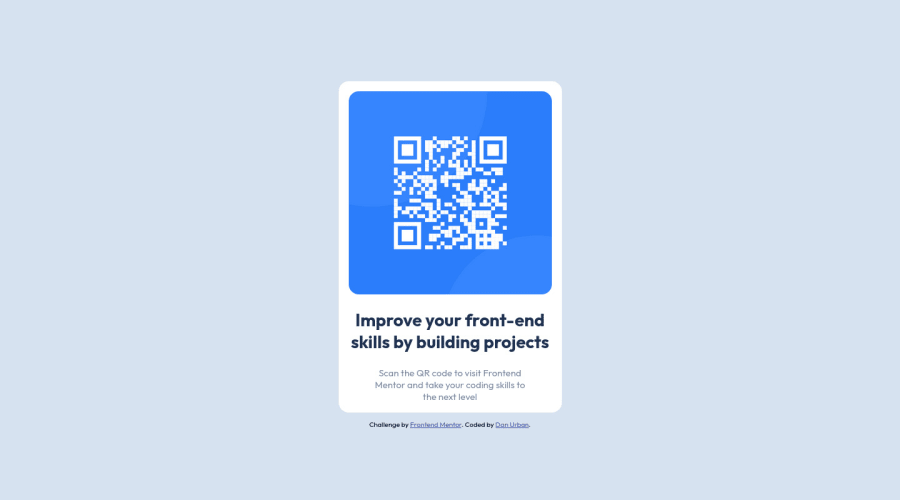
Design comparison
Community feedback
- @ecemgoPosted over 1 year ago
Some recommendations regarding your code that could be of interest to you.
In order to fix the accessibility issues:
- You need to replace
<div class="card">with the<main class="card">tag and<div class="attribution">with the<footer class="attribution">tag. You'd better use Semantic HTML, and you can also reach more information about it from Using Semantic HTML Tags Correctly. - Each main content needs to include at least h1 element so you should use one
<h1>element in the<main>tag. You can replace your<h2>Improve your front-end skill by building project</h2>element with the<h1>Improve your front-end skills by building projects</h1>element.
After committing the changes on GitHub and you need to deploy it as a live site. Finally, you should click generate a new report on this solution page to clear the warnings.
Hope I am helpful. :)
Marked as helpful1@Durban86Posted over 1 year ago@ecemgo thanks. I had an h1 originally, it didn’t look close enough to the solution image and I don’t have the figma files so I made it an h2 and still didn’t like the way it looked and then just changed the css for the tag to a font size that was closer, I’ll just switch it back to the h1.
Also it is deployed to a live site
https://durban86.github.io/frontendmentor-qr-code/
1@ecemgoPosted over 1 year ago@Durban86
This is actually HTML semantic issue that I suggest. According to this rule, at least
h1should be used on each page. When you use it, you need to set its size in CSS.Also, your solution is pretty awesome🎉By the way, happy to help!
Marked as helpful1 - You need to replace
Please log in to post a comment
Log in with GitHubJoin our Discord community
Join thousands of Frontend Mentor community members taking the challenges, sharing resources, helping each other, and chatting about all things front-end!
Join our Discord
