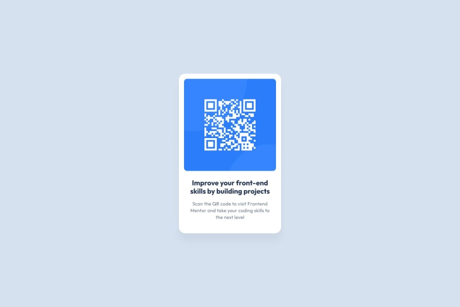
Design comparison
SolutionDesign
Solution retrospective
What are you most proud of, and what would you do differently next time?
- making body's height equals to that of the view port was time-consuming.
- reminded of the need to change the defaults of html and body margin and padding.
- view port height
- aligning main to the middle of the view port
syntax remembering technique
Community feedback
- @saularangurenPosted 8 months ago
Greetings friend, your solution is fine, however it can always be improved, from the colors, measurements and including the technology you use, remember that html and CSS are worked separately, on YouTube you can find a lot of material that can help you improve, happy coding
0 - @kel456Posted 8 months ago
Nice job! Just a few minor tweaks I might suggest:
- The style-guide.md has the color codes that you need; the heading looks black, but the reference's is dark blue
- It looks like there should be a little more space between the heading and body text
- The border-radius of the QR code image could be smaller
Overall, great work!
0 - @smhnfreelancerPosted 8 months ago
font-size: 80%;I didn't expect that for the sub-text. it's mentioned in the style guide to put the font-size to 15px.0
Please log in to post a comment
Log in with GitHubJoin our Discord community
Join thousands of Frontend Mentor community members taking the challenges, sharing resources, helping each other, and chatting about all things front-end!
Join our Discord
