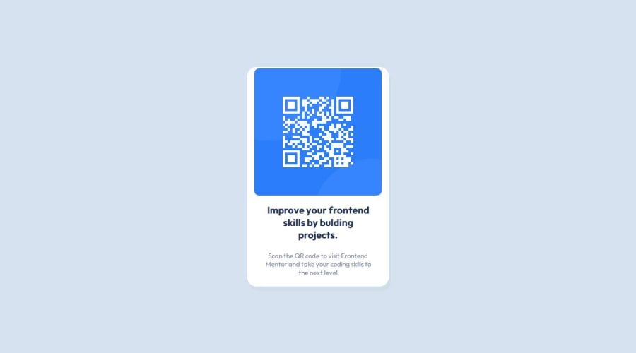
Design comparison
Solution retrospective
Frontend Mentor - QR code component solution
This is a solution to the QR code component challenge on Frontend Mentor. Frontend Mentor challenges help you improve your coding skills by building realistic projects.
Table of contents
Note: Delete this note and update the table of contents based on what sections you keep.
Overview
Screenshot
Add a screenshot of your solution. The easiest way to do this is to use Firefox to view your project, right-click the page and select "Take a Screenshot". You can choose either a full-height screenshot or a cropped one based on how long the page is. If it's very long, it might be best to crop it.
Alternatively, you can use a tool like FireShot to take the screenshot. FireShot has a free option, so you don't need to purchase it.
Then crop/optimize/edit your image however you like, add it to your project, and update the file path in the image above.
Note: Delete this note and the paragraphs above when you add your screenshot. If you prefer not to add a screenshot, feel free to remove this entire section.
Links- Solution URL: [(https://github.com/ababaug/QR-code-component)]
- Live Site URL: [https://ababaug.github.io/QR-code-component/]
My process
Built with- Semantic HTML5 markup
- CSS custom properties
- Flexbox
- Styled Components - For styles
Note: These are just examples. Delete this note and replace the list above with your own choices
What I learnedI have learnt to structure and styled a website using html and css. I have learnt to use flexbox for align the contents on a web page.
To see how you can add code snippets, see below:
  Challenge by
  Frontend Mentor. Coded by Augustine Stephen Abah.

QR Code Component


    Improve your frontend skills by bulding projects.

      Scan the QR code to visit Frontend Mentor and take your coding skills to
      the next level
@import url("https://fonts.googleapis.com/css2?family=Outfit:wght@100..900&display=swap");

* {
  box-sizing: border-box;
  padding: 0;
  margin: 0;
}

body {
  font-family: "Outfit", sans-serif;
  display: flex;
  flex-direction: column;
  justify-content: center;
  align-items: center;
  background-color: hsl(212, 45%, 89%);
}

h1 {
  margin: 5px;
}

.container {
  display: flex;
  flex-direction: column;
  justify-content: center;
  align-items: center;
  width: 320px;
  height: 497px;
  background-color: white;
  border-radius: 20px;
  box-shadow: 5px 10px #12041407;
}

.qr-image {
  width: 288px;
  height: 288px;
}

.qr-image img {
  width: 100%;
  height: 100%;
  border-radius: 10px;
}

.qr-content {
  width: 288px;
  padding: 16px;
  text-align: center;
}

.qr-content h2 {
  font-size: 22px;
  margin-bottom: 15px;
  color: hsl(218, 44%, 22%);
}

.qr-content p {
  font-size: 15px;
  color: hsl(220, 15%, 55%);
}
If you want more help with writing markdown, we'd recommend checking out The Markdown Guide to learn more.
Note: Delete this note and the content within this section and replace with your own learnings.
Continued developmentUse this section to outline areas that you want to continue focusing on in future projects. These could be concepts you're still not completely comfortable with or techniques you found useful that you want to refine and perfect.
Note: Delete this note and the content within this section and replace with your own plans for continued development.
Useful resources- Example resource 1 - This helped me for XYZ reason. I really liked this pattern and will use it going forward.
- Example resource 2 - This is an amazing article which helped me finally understand XYZ. I'd recommend it to anyone still learning this concept.
Note: Delete this note and replace the list above with resources that helped you during the challenge. These could come in handy for anyone viewing your solution or for yourself when you look back on this project in the future.
Author
- Frontend Mentor - @ababaug
I found it very difficult to get the exact padding for the figma designs.
What specific areas of your project would you like help with?I would like help with the interpreting figma designs to build a project.
Please log in to post a comment
Log in with GitHubCommunity feedback
- @ortalyarts
Hey @ababaug!
Congratulations on completing the challenge!
As for Figma: What I use a lot is
- Getting the width and heights of the objects - by just selecting the object you can see it's measures in the right panel.
- Getting the distances between two objects to set them as margins - select one object, then hold option key (on Mac) and hover over the second object. The program will show you red number - it is the margin. Really useful :)
- The same way you can get the paddings: select the object inside some container, hold option key and hover over the container, this will show you all the paddings from this object to the container edges.
- You can also get the exact values for the shadows - select the object with the shadow > go to the "effects" panel (on the right side) > click on the sun icon next to the Drop shadow to see all the values. The effects can be applied to the group or to some object inside a group, so sometimes I have to look where it hides :)
I hope you find this helpful! Cheers :)
Marked as helpful
Join our Discord community
Join thousands of Frontend Mentor community members taking the challenges, sharing resources, helping each other, and chatting about all things front-end!
Join our Discord
