

Design comparison

Solution retrospective
- Center something vertically
I use flex layout to make it, but it doesn't work. I realized that's because I don't give my container a height, this is the reason.
.container {
  height: 100vh;
  display: flex;
  justify-content: center;
  align-items: center;
}
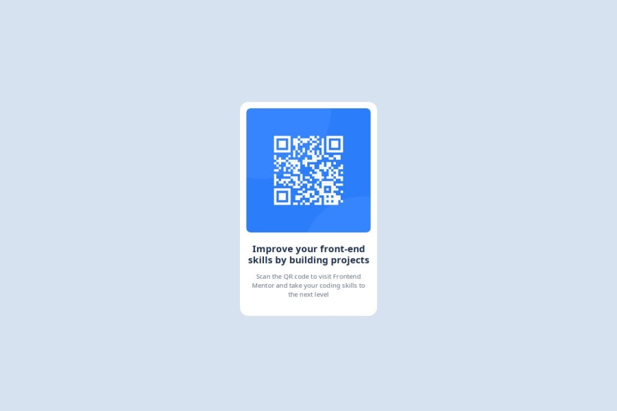
- give pic a border-radius
I wrapped the img with a div(card__img), and give card__img a border-radius, but it didn't work. After searching I found out that I also need to add overflow:hidden to hide the part of the img covered by the rounded corners
- seeing is not believing
must make pic in PS or use figma. I tried to use my screenshot tools to measure and finally get a wrong result.
What specific areas of your project would you like help with?More and more details. Always confused
Community feedback
- @skyv26Posted about 2 months ago
Hi @coyoteshkw,
Thank you for your effort on this project! 😊 I noticed a few areas where we can optimize the structure and styling for better results. Here are my suggestions:
-
Adopt a mobile-first approach 📱:
- Start designing for smaller screens first and progressively enhance for larger screens. This approach reduces complexity, improves performance on mobile devices, and ensures a responsive design with minimal adjustments.
-
Avoid setting fixed heights 🔄:
- Instead of setting a fixed height for elements (e.g.,
height: 500px), allow the inner content to dictate the height by using padding, margin, or flexible layouts. - Opt for
max-widthinstead ofwidthto accommodate various screen sizes dynamically. For instance:
.card { max-width: 320px; padding: 1em; border-radius: 20px; background-color: var(--white-color); } - Instead of setting a fixed height for elements (e.g.,
-
Plan the structure before styling 🗺️:
- Begin by organizing the HTML structure and layout for mobile screens. Gradually build for larger screens using media queries. This method will streamline your CSS, reduce redundancy, and ensure that the website performs well on mobile devices.
By making these small but impactful adjustments, you can significantly enhance the flexibility, responsiveness, and maintainability of your designs. Keep up the great work! 🚀
Marked as helpful1@coyoteshkwPosted about 2 months ago@skyv26 Thanks for the reply about max-width and mobile-first, I will try to use them in my next project :D
1 -

Please log in to post a comment
Log in with GitHub
Join our Discord community
Join thousands of Frontend Mentor community members taking the challenges, sharing resources, helping each other, and chatting about all things front-end!
Join our Discord