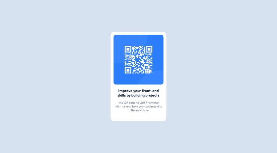
Design comparison
SolutionDesign
Solution retrospective
I need some advice on how to position my text the way the challenge specifies.
Community feedback
- @0xabdulkhaliqPosted over 1 year ago
Hello there 👋. Congratulations on successfully completing the challenge! 🎉
- I have other recommendations regarding your code that I believe will be of great interest to you.
CSS 🎨:
- Using
%to set elementborder-radiusin CSS can lead to unexpected results, especially on devices with varying screen sizes and resolutions.
- One potential issue is that
%units are relative to the size of the screen, which means that if the viewport size changes (e.g. if the user resizes their browser window), the element width will change as well. This can make it difficult to maintain a consistent layout.
- Another issue is that using viewport units to set element widths can cause the elements to become too small or too large on different devices. For example, the component radius may look fine on a desktop computer, but on a mobile device with a smaller screen, the element may take up too much space or not enough space.
- Instead, it is often better to use other units such as
rem,em,px, to set element borders in CSS. These units are more predictable and allow for greater control over the layout of the page. Additionally, it is usually better to use a combination of relative and absolute units to ensure that the layout remains consistent across different devices and screen sizes.
- Example
main {
  border-radius: 1em;
}
.
I hope you find this helpful 😄 Above all, the solution you submitted is great !
Happy coding!
Marked as helpful0 - @ecemgoPosted over 1 year ago
Some recommendations regarding your code that could be of interest to you.
HTML
- You need to add <main> tags inside <body> tags and your html structure should be like that:
<body>
<main>
    <div class="image">
      <img src="images/image-qr-code.png" alt="image-qr">
      </div>
      <div class="desc">
        <h1>Improve your front-end skills by building projects</h1>
        <p>the QR code to visit Frontend Mentor and take your coding skills to the next level</p>
      </div>
  </main>
</body>
CSS
- If you want to reset your CSS initially, you can update it like this:
* { box-sizing: border-box; margin: 0; padding: 0; }- If you want to make the card centered both horizontally and vertically, you'd better add flexbox and
min-height: 100vhto thebody
body { display: flex; flex-direction: column; align-items: center; justify-content: center; background-color: var(--Light-gray); font-family: var(--Oufit); /* overflow: hidden; */ /* margin: 6rem; */ /* max-height: cal(100vh-1px); */ min-height: 100vh; }- If you use
max-width, the card will be responsive - You'd better give
paddingto give a gap between the content and the border of the card - If you give
text-align: center, the texts will be centered
main { background-color: var(--White); border-radius: 5%; max-width: 290px; padding: 15px; text-align: center; }- In addition to that above, in order to make the card responsive and the image positioned completely on the card, you'd better add
width: 100%to the img
img { /* width: 275px; */ width: 100%; border-radius: 5%; }- Finally, you update the texts in this way:
h1 {
  color: var(--Dark-blue);
  font-weight: 700;
  font-size: 1.2rem;
  margin: 1rem 0.5rem;
}
p { color: var(--Grayish-blue); font-weight: 400; margin: 1rem 0.5rem 2rem; }- Finally, you don't need to use
.imageand.descand you can remove them to avoid repetition. Also, if you follow the steps above, the solution will be responsive and you don't need to use media queries for this solution so you can remove it as well.
/* .image {
    display: flex;
    max-width: 100%;
    margin: 20px auto;
    margin-bottom: 0;
} */

/* .desc {
  text-align: center;
  margin: 1.25rem;
  margin-top: 2%;
  margin-bottom: 0;
} */

/* @media (min-width: 600px) {
  body {
    width: 300px;
    align-items: center;
    justify-content: center;
    max-height: cal(100vh-1px);
    margin: auto;
    margin-top: 5rem;
  }
} */
Hope I am helpful. :)
Marked as helpful0 - @Kamlesh0007Posted over 1 year ago
We can change the alignment of the text using the text-align property. We can align the text in the center, Left, Right.
example:- <html>
<head> <title>Text alignment</title> </head> <body> <h1>hello</h1> </body> </html>0
Please log in to post a comment
Log in with GitHubJoin our Discord community
Join thousands of Frontend Mentor community members taking the challenges, sharing resources, helping each other, and chatting about all things front-end!
Join our Discord
