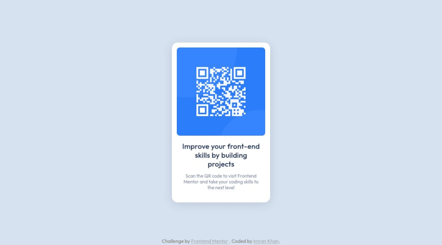
Design comparison
Community feedback
- @HassiaiPosted over 2 years ago
Replace <h2> with <h1> and <div class="attribution"> with the footer tag to fix the accessibility issues.
To center .card on the page using flexbox, replace the height in the body with min-height: 100vh. Add font-size of 0.9375rem to the body, this reduce the font size of h1 and p. Give p and h1 the same padding-left and padding right value. Give p a margin-bottom value.
Hope am helpful.
Well done for completing this challenge. HAPPY CODING
Marked as helpful0@astr0n0merPosted over 2 years ago@Hassiai Thank you for your feedback
I've updated the solution and it's live here
Not sure why the Design Comparison Report is showing a different view than my live site
1
Please log in to post a comment
Log in with GitHubJoin our Discord community
Join thousands of Frontend Mentor community members taking the challenges, sharing resources, helping each other, and chatting about all things front-end!
Join our Discord
