

Design comparison

Community feedback
- @grace-snowPosted 4 months ago
This looks really good. It seems you’ve already applied lots of good feedback. Here’s a bit more!
- you need to remove the aria-label from the img. Don’t add aria-labels unnecessarily. The img has an alt and that’s all it needs.
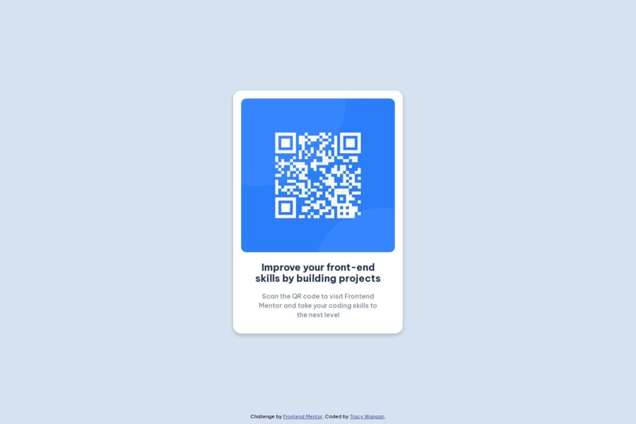
- ideally you should shorten this alt. You’re just using long phrasing which isn’t needed. I’d change to “QR code to FrontEndMentor.io”. That’s clear enough for this.
- it’s better for performance to link fonts in the html head instead of css imports.
- look up modern css resets and get into the habit of including them in full at the start of the styles in every project you ever do. I like Andy Bell’s one.
- I wouldn’t expect the heading to need padding in this.
Marked as helpful1@26TracyNjorogePosted 4 months ago@grace-snow Thanks for the feedback! I’ve applied the changes and will keep honing my skills using the suggestions.
0 - P@Islandstone89Posted 4 months ago
Hi Tracy, good job.
Here are some suggestions :)
HTML:
-
You don't need to include words like "image" or "photo" in alt text, as "Qr code image" would be announced by screen readers as "image, Qr code image". The alt text must also say where it leads(the frontendmentor website). A good alt text would be "QR code leading to the Frontend Mentor website."
-
I would change the heading to a
<h2>- a page should only have one<h1>, reserved for the main heading. As this is a card heading, it would likely not be the main heading on a page with several components. -
Change
.attributionto a<footer>, and use<p>for the text inside. The<footer>must be outside of the<main>- both should be direct children of the<body>.
CSS:
-
Including a CSS Reset at the top is good practice.
-
I recommend adding a bit of
padding, for example16px, on thebody, to ensure the card doesn't touch the edges on small screens. -
Use the style guide to find the correct
font-family, and remember to specify a fallback font:font-family: 'Outfit', system-ui, sans-serif; -
On the
body, changeheighttomin-height: 100svh- this way, the content will not get cut off if it grows beneath the viewport. Addflex-direction: columnand agapof for example20px. -
Remove
margin-bottomon the card. -
Remove the
widthon the card. We rarely want to give a component a fixed size, as we need it to grow and shrink according to the screen size. You can also removeheight: auto, as that is its default value. -
We do want to limit the width of the card, so it doesn't get too wide on larger screens. To solve this issue, give the card a
max-widthof around20rem. -
font-sizeon the footer must also be set in rem. Here is a great article explaining whyfont-sizemust never be in px. -
Since all of the text should be centered, you only need to set
text-align: centeron the body, and remove it elsewhere. The children will inherit the value. -
Paragraphs have a default value of
font-weight: 400, so there is no need to declare it. -
On the image, add
display: block,height: autoand changewidthtomax-width: 100%- the max-width prevents it from overflowing its container. Without this, an image would overflow if its intrinsic size is wider than the container.max-width: 100%makes the image shrink to fit inside its container.
Marked as helpful1@26TracyNjorogePosted 4 months ago@Islandstone89 Thank you for the detailed feedback! I’ve made the changes and will continue practicing these best practices.
1 -
- @ortiz-antonioPosted 4 months ago
Looks good!
Here are my two cents:-
Variable naming convention: Usually, CSS variables have a suffix to indicate their purpose. For colors, I see most people use
--colors-, although I’ve also seen--clrs-. -
CSS naming convention: You can follow a CSS naming convention like BEM, OOCSS, SMACSS, or SUIT CSS.
-
Question about accessibility: How can a user with a visual disability, who needs to use zoom on mobile, read the content without needing to do horizontal scrolling?
Marked as helpful1@26TracyNjorogePosted 4 months ago@ortiz-antonio Thanks for the input! I’ll refine my approach and keep accessibility and conventions in mind.
0 -


Please log in to post a comment
Log in with GitHubJoin our Discord community
Join thousands of Frontend Mentor community members taking the challenges, sharing resources, helping each other, and chatting about all things front-end!
Join our Discord