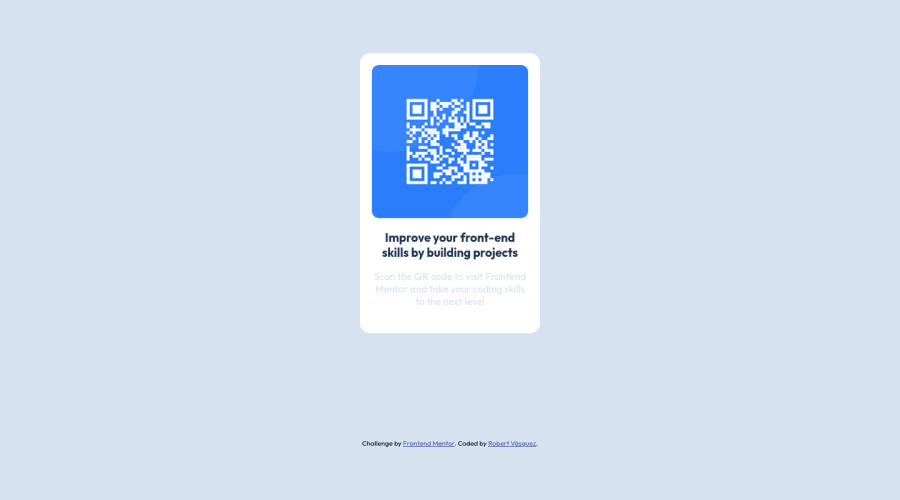
Design comparison
SolutionDesign
Community feedback
- @ecemgoPosted almost 2 years ago
Some recommendations regarding your code that could be of interest to you.
- If you want to make the card centered both horizontally and vertically, you'd better add
align-items: centerandjustify-content: centerto thebody
body { align-items: center; justify-content: center; }- If you use
max-widthinstead ofwidthandheight, it makes the card responsive
.container__card { /* width: 18rem; */ max-width: 18rem; /* height: 28rem; */ }- In addition to that above, in order to make the card responsive and the image positioned completely on the card, you'd better remove
height: 60%from the img
.container__img { /* height: 60%; */ }- Finally, you don't need
.containerand you can remove it to clean the code
/*
.container {
  margin: auto;
  max-width: 144rem;
}
*/
Hope I am helpful. :)
0 - If you want to make the card centered both horizontally and vertically, you'd better add
- @cmachdevPosted almost 2 years ago
Hi, good work but add
to center horizontal and vertical add to body justify-content: center; align-items: center; - along with the others you have.
feel free to delete the property margin: auto; from .container
0
Please log in to post a comment
Log in with GitHubJoin our Discord community
Join thousands of Frontend Mentor community members taking the challenges, sharing resources, helping each other, and chatting about all things front-end!
Join our Discord
