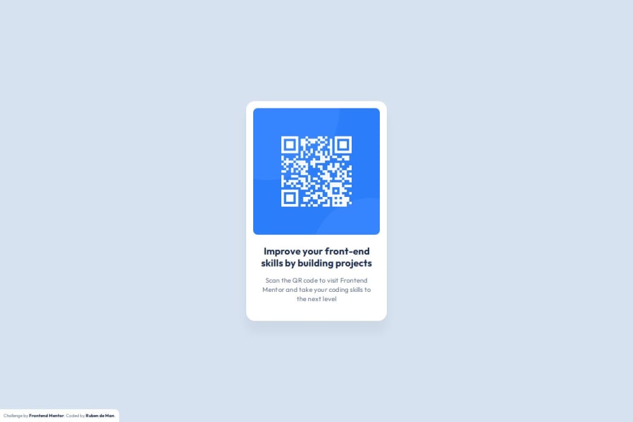
Design comparison
Community feedback
- @skyv26Posted 3 months ago
Hi @developer-ruben,
Great Job! 🎉
Your design is nearly pixel-perfect! ✨
Just a small adjustment in letter-spacing, and it will perfectly match the actual design.Keep up the amazing work! 💪😊
Marked as helpful0P@developer-rubenPosted 3 months ago@skyv26 Thanks! I just updated the letter-spacing of the card text to .2px like the Figma design, but it looks like the Figma design is a bit different than the screenshot-design :')
1@skyv26Posted 3 months ago@developer-ruben wow! Great. Now, it's pixel-perfect to my eyes. Yeah, you are right. But it's ok if you match more than 85%. Good Job.
0
Please log in to post a comment
Log in with GitHubJoin our Discord community
Join thousands of Frontend Mentor community members taking the challenges, sharing resources, helping each other, and chatting about all things front-end!
Join our Discord
