

Design comparison

Solution retrospective
Feedback pleaseee! <3
Community feedback
- @pperdanaPosted over 1 year ago
Hello there👋!! Congratulations on completing this challange.
- I have some additional recommendations for your code that I think you'll find interesting and valuable.
📌 Image element do not have
altattributes or you leave it blankfor example code
<img src="images/image-qr-code.png">In this code you should add
altin your code<img src="images/image-qr-code.png" alt="qr code" >- This
altattribute provides alternative text for images, which is important for accessibility purposes. Screen readers, use the alt attribute to read out loud what the image is about, allowing visually impaired users to understand the content of the page.
I hope you found this helpful! 😊
Happy coding🤖
Marked as helpful0 - @0xabdulkhaliqPosted over 1 year ago
Hello there 👋. Congratulations on successfully completing the challenge! 🎉
- I have other recommendations regarding your code that I believe will be of great interest to you.
HTML 🏷️:
- This solution may cause accessibility errors due to lack of semantic markup, which causes lacking of landmark for a webpage and allows accessibility issues to screen readers, due to accessibility errors our website may not reach its intended audience, face legal consequences, and have poor search engine rankings, highlighting the importance of ensuring accessibility and avoiding errors.
- What is meant by landmark ?, They used to define major sections of your page instead of relying on generic elements like
<div>or<span>. They are use to provide a more precise detail of the structure of our webpage to the browser or screen readers
- For example:
- The
<main>element should include all content directly related to the page's main idea, so there should only be one per page - The
<footer>typically contains information about the author of the section, copyright data or links to related documents.
- The
- So resolve the issue by replacing the
<div class="container">element with the proper semantic element<main>in yourindex.htmlfile to improve accessibility and organization of your page
.
I hope you find this helpful 😄 Above all, the solution you submitted is great !
Happy coding!
Marked as helpful0 - @ecemgoPosted over 1 year ago
Some recommendations regarding your code that could be of interest to you.
HTML
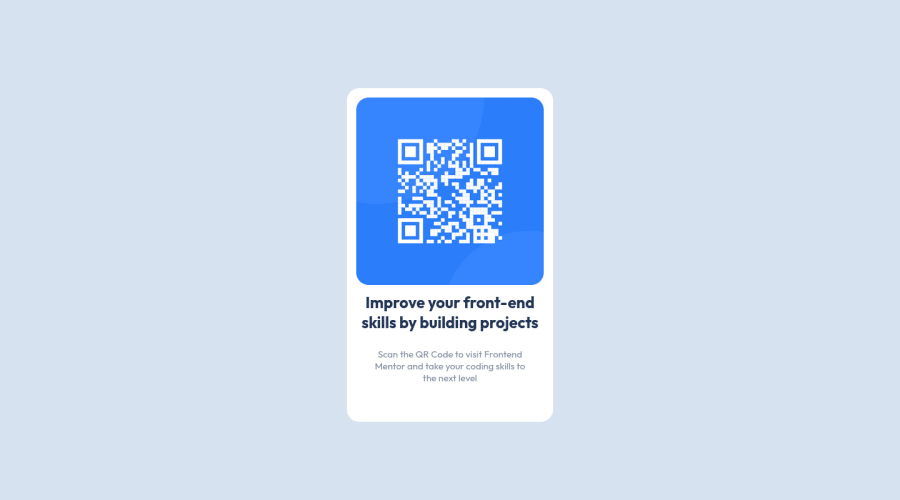
- Your html structure should be like that:
<body> <main class="item"> <img class="img" src="code.png" alt=""> <h1 class="texto-1">Improve your front-end skills by building projects</h1> <p class="texto-2">Scan the QR Code to visit Frontend Mentor and take your coding skills to the next level</p> </main> </body>- If you want to use the recommended font-family for this project, you can add the following between the
<head>tags in HTML file:
<link rel="preconnect" href="https://fonts.googleapis.com">
<link rel="preconnect" href="https://fonts.gstatic.com" crossorigin>
<link href="https://fonts.googleapis.com/css2?family=Outfit:wght@400;700&display=swap" rel="stylesheet">
CSS
- After adding them to the HTML, you can add this font-family to the
bodyin CSS file: - If you want to make the card centered both horizontally and vertically, you'd better add flexbox and
min-height: 100vhto thebody
body { font-family: 'Outfit', sans-serif; display: flex; flex-direction: column; justify-content: center; align-items: center; min-height: 100vh; }- If you use
max-width, the card will be responsive - You'd better give
paddingto give a gap between the content and the border of the card - If you give
text-align: center, the texts will be centered
.item { /* border: 15px solid #fff; */ /* padding-bottom: 200px; */ background-color: #fff; border-radius: 20px; max-width: 280px; text-align: center; padding: 15px 15px 30px; }- In addition to that above, in order to make the card responsive and the image positioned completely on the card, you'd better add
width: 100%for the img
.img { /* height: 300px; */ /* width: auto; */ border-radius: 20px; width: 100%; }- Finally, you don't need to use
.containerand.textoand you can remove them to clean the code
/* .container { display: flex; justify-content: center; align-items: center; height: 100vh; } */ /* .texto { position: absolute; top: 67%; left: 50%; transform: translate(-50%, -50%); text-align: center; font-family: Outfit; } */- You'd better reduce font-size of texts but it's up to you whether you update it or not
After committing the changes on GitHub and you need to deploy it as a live site. Finally, you should click generate a new report on this solution page to clear the warnings.
Hope I am helpful. :)
Marked as helpful0 - @JagholinPosted over 1 year ago
Ok, feedback:
- indentation and consistent code formating is important, really important. Not only does it make reading your code easier, but also is an indicator of overall quality. If you are lazy, you can use automatic formatters like Prettier
- Don't use
<br>tags, unless absolutely necessary. HTML is for structuring your page, not for making some micro style corrections. width: autodoesnt do anything, andwidth: 100%is in many cases either not needed, or outright harmful. Block elements automatically take up the entire available width space.- dont use
position: absolutewithout a good reason. You dont even need it here, just place your text elements below the image. In your solution, this breaks layout for a range of viewport heights.
So how to fix:
- first, correct your structure. It should look something like this:
.container .img .text .title .content- then, remake your styles to fit the new structure. Dont use magic numbers like
top: 67%; left: 50%;Instead, let the layout flow naturally from top to bottom. Utilize CSS box model to tweak positioning of elements.
Marked as helpful0


Please log in to post a comment
Log in with GitHub
Join our Discord community
Join thousands of Frontend Mentor community members taking the challenges, sharing resources, helping each other, and chatting about all things front-end!
Join our Discord