

Design comparison

Solution retrospective
These were the questions that accompanied my original submission. They were answered but the more the merrier I say. Thanks!
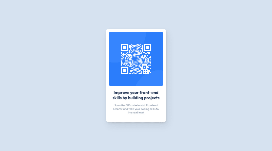
Question 1: I set the dimensions of the component card using pixels like so: width: 320px; height: 496px; I think I was worried if using fixed dimensions it wouldn't be truly responsive. Is that a misconception or would it be more appropriate to use a different unit like percent or rem instead of px?
Question 2: Did I successfully build it? I was surprised that the dimensions were the same for both the mobile and desktop versions. Did it just work out that way or have I made a mistake?
Question 3: Other than adding an alt tag to the image, I wasn't sure what other accessibility features I could include. Please let me know if I missed any - I'm still just learning the basics of accessibility.
Thank you in advance for your time and feedback. This is my first submission to Frontend Mentor.
Please log in to post a comment
Log in with GitHubCommunity feedback
No feedback yet. Be the first to give feedback on Jason Greenwald's solution.
Join our Discord community
Join thousands of Frontend Mentor community members taking the challenges, sharing resources, helping each other, and chatting about all things front-end!
Join our Discord