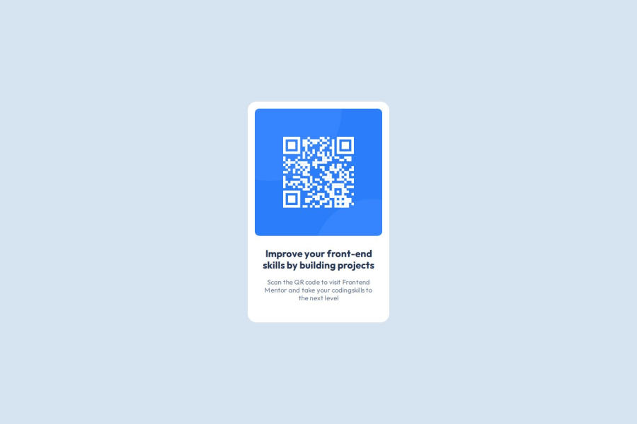


Design comparison

Solution retrospective
- First Of all I leant to document my learning for the first time. Thanks to Frontend Mentor for this template.
- I learnt to setup font-size as 10px for the html, so that I can use rem with a clear understanding and reference of 10px in my mind.
 html {
      font-size: 10px;
    }
- Changing the box-sizing to border box helped to make alot sense. I learnt that the default sizing is related to the content box. (Correct me if I'm wrong).
- Started by setting up the basic style. Initailly I messed up but after a while I kind a started catching up with styles
- Setting up with css variable for colors
:root { --backgroung: hsl(211, 45%, 89%); --white: hsl(0, 0%, 100%); --text-color-light: hsl(216, 15%, 48%); --text-color-mid: hsl(216, 15%, 48%); --text-color-dark: hsl(218, 44%, 22%); } - Tried using aspect ratio for keep the height and width consistent.
  .attribution {
    aspect-ratio: 0.64/1;
    margin: 0 1rem;
    max-width: 32rem;
    background-color: var(--white);
    padding: 1.6rem 1.6rem 4rem 1.6rem;
    border-radius: 2rem;
  }
- I would like to learn more about WCAG
- I will also try using vw for font styling which I tried to apply in this project, but it didn't work.
- I will also try to take font styling more seriously. Including letter spacing nad line height.
-
I couldn't find a way to keep the height and width proportionally consistent. For this I used aspect-ratio. Also, I did set the max-width.
-
Reading through style-guide, I came across something called 'WCAG' and I didn't know what it means.
-
I have tried following WCAG. If there are any suggestion please tell me.
I am still a little confused about the font-size. I did solve it by using rem. But I'm not seemed to make sense to me. I wanted the font to be controlled by the width of the parent width. The far I got was setting the font-size to viewport width. But it made the font overflow. why did the rem work for font-size and how. Is there any better idea than using rem for fonts.
Community feedback
- @TedJenklerPosted 2 months ago
Hi @aditya-alshi,
Nice project! Here are a few tips for improvement:
Simplify Structure: It looks like the project is a bit over-nested and more complex than necessary. I suggest challenging yourself to complete this project using just one container. With Flexbox, you could easily reduce the number of containers to two instead of three. Starting to use <div> elements more sparingly will save you a lot of trouble in larger projects.
Heading Levels: While using an <h1> is not wrong in this context, it could be problematic if you plan to reuse this for a component. In components, it’s best to start with an <h2> to maintain proper heading hierarchy and simulate a more realistic environment.
SEO Practice: This project is a great opportunity to practice SEO. Experiment with the SEO title and description, and then share your solution link on Discord to see the difference. It’s a valuable skill that can improve the visibility and reach of your projects.
Keep up the great work!
Marked as helpful1@aditya-alshiPosted 2 months agoHi @TedJenkler
Thank you for your time and insightful feedback. I've removed the <div> as you suggested. Your advice about starting with an <h2> in components was incredibly helpful—I would have never thought of that, but it makes perfect sense now. I've made the change and added an <h1> as well, keeping it hidden with
display:none;.I've removed the <div> element and made the <main> a single container. I can already see how this approach makes the project cleaner.
I also included <meta> tags for SEO, updated the title, and added a description.
One thing I’d greatly appreciate your input on is fonts. I might sound a bit clueless here, but choosing and making fonts responsive confuses me a lot. If you have any tips or suggestions, I’d be really grateful.
Thank you again for your valuable feedback—I truly appreciate it and hope I’ve addressed your points effectively.
1@TedJenklerPosted 2 months ago@aditya-alshi Glad you found it useful! I'll be honest, fonts aren't my strong suit, but it's best practice to use clamp() to make them responsive.
Personally, I've never felt that responsive fonts were strictly necessary, though this is probably more due to client budget constraints on my end. In most cases, using three media queries, for mobile, tablet, and desktop, has been sufficient.
I'd recommend to spend energy learning CSS animations or picking up some CSS frameworks like SCSS or LESS rather than mastering fonts. However, if you're passionate about it, there are plenty of tricks with clamp() and responsive units like rem, em, vh, and vw to explore.
0 - @skyv26Posted 2 months ago
Hi @aditya-alshi,
You're doing awesome with the QR code component! 🙌 Let’s dive into your question about
remand font sizing:1. Why
remworks?Since you’ve changed the default font size on
<html>to10px, now1remequals10px. This makes the font sizes super flexible and easier to manage across the site. 👌2. Better approach than
rem?Let’s level it up! Combine
remwithvwto create truly responsive typography:h1 { font-size: calc(1.5rem + 2vw); }This keeps things flexible without causing that annoying text overflow on smaller screens. 📱
3. Responsive fonts with Media Queries
You can still fine-tune your font sizes with media queries! Here’s a cool trick:
@media (max-width: 600px) {
  html { font-size: 8px; }
}
This gives you full control over your design on any screen size. 🌍
4. Make it Pixel-Perfect with
line-heightTo make everything look super clean and polished, add some
line-heightto your paragraphs. It’s like giving your text some breathing room. 🧘♂️.light-p { line-height: 1.5; /* Adjust for readability */ }This little tweak will bring your design to perfection! 🎯
In Summary:
- You’ve nailed the
remsetup by changing the root font size. 👏 - Use
rem,vw, and media queries together for responsive text that adapts smoothly to any screen. 📱 - Don’t forget that
line-heightfor the ultimate pixel-perfect look! 🎨
Keep up the great work! You’re crushing it! 💪🌟
Marked as helpful0 - You’ve nailed the


Please log in to post a comment
Log in with GitHub
Join our Discord community
Join thousands of Frontend Mentor community members taking the challenges, sharing resources, helping each other, and chatting about all things front-end!
Join our Discord