

Design comparison

Solution retrospective
This was my first project to practice HTML and CSS from scratch and it took me several days to complete. I guess I am proud that I stuck with it. I don't think I would do anything differently regarding my process.
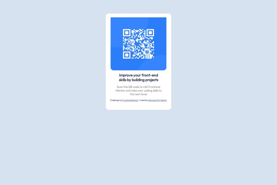
What challenges did you encounter, and how did you overcome them?I was struggling to remember all that I've learned thus far. My biggest challenge is centering div containers. Also, when I added padding to the QR code image, I lost the left and right border radiuses. I tried to overcome the challenges by researching on the net, watching videos, etc., but no matter what I tried regarding the border radiuses, I couldn't get them to stay. I spent hours and days on this project and feel that I should have been able to complete it in an hour...I'm feeling discouraged.
What specific areas of your project would you like help with?I would like help with a few things if anyone would be kind enough: 1) Did I use the right code to center my divs? If not what was I suppose to do? 2) I know why I lost the top left and top right border radiuses, but I tried everything I could to get them back, to no avail. How could I have avoided that or at least compensated for it? 3) I tried using the Figma file but it didn't work when I uploaded it to Figma, so much of the design was guesswork. I don't understand why my fonts (which were not guesswork) did not line up like the example and the h1 700 font-weight doesn't look the same as the example. Thank you for your kindness in helping me!
Community feedback
- @DJong90Posted 4 months ago
Good evening Margarida, I've been looking at the files for your QR-code challenge, and since I also did it recently, yours ended up appearing for me. I hope I can contribute to its development. So from what I saw, your QR-code image inside the div.container had a straight top, without rounded edges, correct? This happened because when you put the padding-top: 20px command, it created an internal padding and lost the edges. The easy way to solve this situation in your case would be to remove this command from inside the img in the CSS and put it inside the container div, so it will have rounded edges and respect the card's spacing. I ended up doing mine with display flex, which made it easier to align the elements on the card. I hope I've helped in some way.
Marked as helpful0@martymar-beepPosted 4 months ago@DJong90 Hello Franciscus! That's amazing! It worked like a charm. I feel like I should understand why it worked, but I don't as of yet, but I am so happy for your help! Thank you very much and happy coding!
1 - @IonCatanaPosted 4 months ago
Hi Margaret, I would like to give you some feedback. Areas for Improvement and Correct Approaches
- Responsive Design Instead of fixed widths (340px), use relative units like percentages (%) or viewport units (vw). For example: css .container { width: 100%; max-width: 340px; } Add media queries to adjust the layout for smaller devices, ensuring readability and usability.
- Vertical Centering To vertically center the container, use Flexbox or CSS Grid. Here's a simple Flexbox approach: css body { display: flex; justify-content: center; align-items: center; min-height: 100vh; margin: 0; }
- Semantic HTML Replace the incorrect closing tag <img></image> with the correct self-closing tag <img />. Enhance the alt attribute description to make it more meaningful, e.g.: html <img src="./images/image-qr-code.png" alt="QR Code linking to Frontend Mentor homepage" />
- Contrast and Text Readability The paragraph text color (gray) can be hard to read on certain screens. Use a slightly darker color for better contrast: css p { color: hsl(218, 20%, 35%); }
- Global Reset Include a global reset to avoid browser inconsistencies. For example: css
- { margin: 0; padding: 0; box-sizing: border-box; }
- Font Optimization Avoid loading unused fonts in the Google Fonts link. Only include the ones you use in the project (e.g., remove Parkinsans and Space Mono).
- Responsive Image Handling Set the image width to 100% of the container to ensure it scales properly on smaller screens: css img { width: 100%; border-radius: 15px; }
- Padding Consistency Replace the fixed padding (padding-top: 20px) with consistent all-around padding for better spacing: css .container { padding: 20px 15px; }
0@martymar-beepPosted 4 months ago@IonCatana
Hello Ion! Thank you SO much for all of your help!! I've learned a lot from your suggestions. I tried everything that you suggested but I got very confused and my design kept changing so I copied your notes and will use your suggestions in my next project! I did correct #6, #4 and #3 because they were pretty straightforward. Thank you again so much for taking the time to look over my code and make so many very helpful suggestions!
1


Please log in to post a comment
Log in with GitHub
Join our Discord community
Join thousands of Frontend Mentor community members taking the challenges, sharing resources, helping each other, and chatting about all things front-end!
Join our Discord