

Design comparison

Solution retrospective
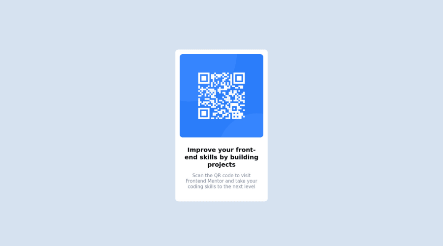
Submitting my attempt at the QR Project, feedback welcome :)
Community feedback
- @DavidMorgadePosted over 2 years ago
Hey Shane, congrats on finishing the challenge pretty good job almost getting it pixel perfect!
It seems that your fonts are not loading correctly and you are using the default sans_serif instead of 'Outfit', this is cause you are importing the wrong fonts on your styles.css.
Instead of importing Poppins like this:
@import url('https://fonts.googleapis.com/css2?family=Poppins:wght@200;300&display=swap');You should import 'Outfit' wich should be this:
@import url('https://fonts.googleapis.com/css2?family=Outfit:wght@400;700&display=swap');Remember that when you get your fonts from google fonts you have to select the weights depending on what the style guide ask, in this case it was 400 and 700.
Hope my feedback helps you, and keep going on more challenges!
Marked as helpful1@ChaffexdPosted over 2 years ago@DavidMorgade Thank you so much for that! I was wondering why my font looked different and couldn't seem to figure it out. Poppins was used in my last visit to Google fonts haha. Great spot, appreciate your feedback!
1 - @correlucasPosted over 2 years ago
👾Hello Shane, congratulations for your first solution and 😎 welcome to the Frontend Mentor Coding Community!
Great first solution and good work putting everything together!
The only thing I suggest you to change is the
idyou've used to give the component style, give preference to style your elements withclassor the direct selector for each element and useidfor forms or things related to Javascript, this way you've a code with the industry standard.Other cool thing to do is an exercise to clean your code, you can do it , removing all divs except the main one and keep all content inside this single div/block, for example, div --> img, h1 and p.
👋 I hope this helps you and happy coding!
1 - @PhoenixDev22Posted over 2 years ago
Hi Shane Chaffe,
Congratulation on completing this frontend mentor challenge. Your solution looks great. I have some suggestions regarding your solution:
- Add
min-height: 100vhinstead ofheight: 100vhto the body that let the body grows taller if the content outgrows the visible page instead. width: 300pxan explicit width is not a good way to have responsive layout . Consider usingmax-widthto the card inrem.- Really important to keep css specificity as low/flat as possible. It’s not recommended use the id's to target the DOM elements for styling purposes , using ID's creates problems due to the specificity , better to use class so that it could be more manageable and reusable.
- Consider using rem and em units as they are flexible, specially for font size better to use rem. If your web content font sizes are set in absolute units, such as pixels, the user will not be able to re-size the text or control the font size based on their needs. Relative units “stretch” according to the screen size and/or user’s preferred font size, and work on a large range of devices
Hopefully this feedback helps.
1 - Add


Please log in to post a comment
Log in with GitHubJoin our Discord community
Join thousands of Frontend Mentor community members taking the challenges, sharing resources, helping each other, and chatting about all things front-end!
Join our Discord