Design comparison
Solution retrospective
I'm a newbie.all feedbacks are welcomed
Community feedback
- @godmayhem7Posted about 2 years ago
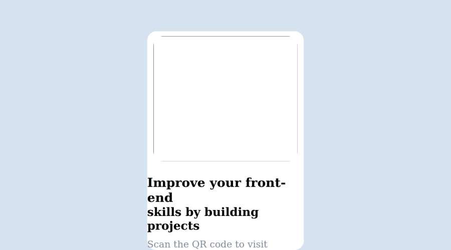
hey @4thowhefe your code was absolutely amazing 👏👏, i think your front end skills are amazing, here are some tips to help you better your code; i think you forgot to import your styles from google fonts and also you deleted all the extra files and folders that was in the challenge folder and i think that is why you didn't have any image in your website as a web developer certain things shouldn't be taken for granted some of those images where to show you how your solution should look like the read.md files were to show you the font-size and colors you should use on your site and also some of the images were to what image will be displayed on your website. to be a good coder i think that you shouldn't take things likely all those files were resources to help you make the website as it is in the challenge. the rest of your code was okay. hope this feedback was helpful 👍👍👍
Marked as helpful0 - @amalkarimPosted about 2 years ago
Hi Yome 👋
Welcome to Front End Mentor community. Congratulations for completing your first challenge in here!
As for your solution, let me give you some suggestions:
- We want to place the card at the center both vertically and horizontally, right? Instead of using
margin-top: 100px;in<div class="white">, let's addalign-items: center;andpadding: 50px;to thebody. That will make sure the card stays in the middle of the page no matter the browser width. - You may want to use the same technique for
<div class="white">itself. See the sample code below.
.white {
  display: flex;
  align-items: center;
  justify-content: center;
}
By using those styles, you will create neater code and design consistency across the page.
- Make sure to also upload the folder that contains the image, so the image will be loaded successfully.
- Add this to the top of your css file to load the recommended font from Google Fonts and set the
font-familyfor the page:
@import url('https://fonts.googleapis.com/css2?family=Outfit:wght@400;800&display=swap');

html {
  font-family: 'Outfit', sans-serif;
  font-size: 15px;
}
Hope these help. Happy coding!
1 - We want to place the card at the center both vertically and horizontally, right? Instead of using
Please log in to post a comment
Log in with GitHubJoin our Discord community
Join thousands of Frontend Mentor community members taking the challenges, sharing resources, helping each other, and chatting about all things front-end!
Join our Discord
