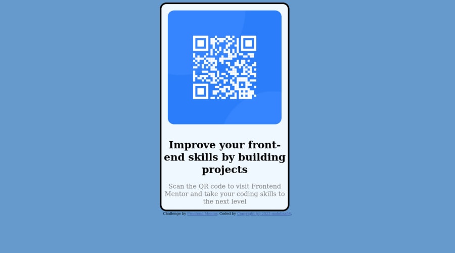
Design comparison
Solution retrospective
i just find some difficult in the colors
Community feedback
- @ecemgoPosted almost 2 years ago
Some recommendations regarding your code that could be of interest to you.
Your solution is not responsive now. If you want that this solution is responsive, you can follow these suggestions below.
HTML
- If you want to use the recommended font-family for this project, you can add the following between the
<head>tags in HTML file:
<link rel="preconnect" href="https://fonts.googleapis.com">
<link rel="preconnect" href="https://fonts.gstatic.com" crossorigin>
<link href="https://fonts.googleapis.com/css2?family=Outfit:wght@400;700&display=swap" rel="stylesheet">
CSS
- After adding them to the HTML, you can add this font-family to the
bodyin CSS file: - In order to center the card vertically and horizontally, you'd better add flexbox and
min-height: 100vhto thebody - For the color of the screen, you can use the recommended color in the
body
body { font-family: 'Outfit', sans-serif; /* background-color: #6699CC; */ background-color: hsl(212, 45%, 89%); display: flex; flex-direction: column; justify-content: center; align-items: center; min-height: 100vh; }- If you use flexbox in the
body, you don't need to usemargin,topandpositionin the.bordto center the card - If you use
max-widthinstead ofwidthandheight, the card will be responsive and you'd better reduce the width a bit - You'd better give
paddingto give a gap between the content and the border of the card
.bord{ /* position: relative; */ /* margin-left: 35%; */ /* top: 50%; */ /* width: 400px; */ max-width: 280px; /* height: 650px; */ /* border: 5px solid; */ border-radius: 20px; /* background-color: aliceblue; */ background-color: white; padding: 20px; }- In addition to that above, in order to make the card responsive and the image positioned completely on the card, you'd better add
width: 100%for the img in this way:
img{
    /* width: 360px; */
     width: 100%;
     display: block;
     border-radius: 20px;
     /* margin: 20px 20px 20px 20px; */
}
Hope I am helpful. :)
Marked as helpful0 - If you want to use the recommended font-family for this project, you can add the following between the
- @Bader-IdrisPosted almost 2 years ago
You can set the container in the middle of the screen whatever user changes it when you add these properties to it in CSS:
.container {
  position: absolute;
  top:50%;
  left: 50%;
  transform: translate(-50%, -50%);
}
the new feature is transform, it has many lovely properties you can discover, I personally love it. Hope it's useful
Marked as helpful0
Please log in to post a comment
Log in with GitHubJoin our Discord community
Join thousands of Frontend Mentor community members taking the challenges, sharing resources, helping each other, and chatting about all things front-end!
Join our Discord
