Design comparison
SolutionDesign
Solution retrospective
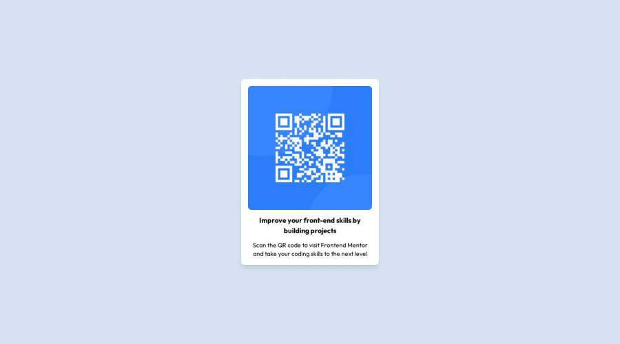
The h1 and p element doesnt look exactly like the preview. I used tailwind and i dont know how to fix it :(.
Community feedback
- @IryDevPosted over 1 year ago
Hey @HumbleBumble01, well done for completing this challenge😄
I have some advice in order to improve your solution :
- You can increase the size of your h1 by adding the class text-lg (it could be also xl or something else) here's a link to know more about that : font-size
- You can custom your own colors with tailwind by editing the tailwind.config.js file
tailwind.config.js :
/** @type {import('tailwindcss').Config} */
module.exports = {
  theme: {
    colors: {
// you can add your own colors like this
      transparent: 'transparent',
    },
  },
}
I hope you'll find this helpful😄
0
Please log in to post a comment
Log in with GitHubJoin our Discord community
Join thousands of Frontend Mentor community members taking the challenges, sharing resources, helping each other, and chatting about all things front-end!
Join our Discord
