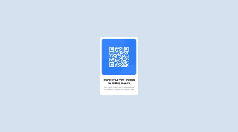
Design comparison
Solution retrospective
Im not sure if I did the sizing write?
Community feedback
- @Aimal-125Posted over 1 year ago
Bro in your CSS code, try
padding: 1rem;to <body> tag. Because when i rotate my mobile in the landscape orientation your card is attached to the top and bottom of body. By giving padding to the body element it will push the card and will look good on small heighted screens.0 - @PRINCEKK122Posted over 1 year ago
Congratulations on completing your first challenge.
I saw a couple of things in your code that I would like to share with you.
Firstly, although it accepted to mix HTML and CSS in your html file, it considered a bad practice as this violates the Separation of Concern in programming. To be specific, avoid at all cost styling in your HTML file and do this in your CSS file as you have done already in the
stylesheet.cssfile. So cut the code in the body element'sstyleattribute, and paste it in a ruleset in the CSS file.Also, I think your code is a little bit hard to read because it not formatted properly. A quick fix is by installing
Prettierplug in, and turning on auto save feature if you are using VS code, to format your code properly.Also for the layouts, you can consider learning more about
FlexboxandCSS Grid. You can learn about them onfreecodecamp.org, as centering elements vertically with Display positioning and translate property is quite tricky.0
Please log in to post a comment
Log in with GitHubJoin our Discord community
Join thousands of Frontend Mentor community members taking the challenges, sharing resources, helping each other, and chatting about all things front-end!
Join our Discord
