

Design comparison

Solution retrospective
I did not encounter any challenges.
What specific areas of your project would you like help with?- what could be improved?
- is css up to today's standards?
Community feedback
- @Alex-Archer-IPosted 9 months ago
Hi!
Congrats with your first challenge =)
Here is a few suggestions about css and stuff.
- It's not a good idea to use 62.5% trick. You can read about it here (and it's a good article about css units at all).
- To make your card more responsive it's better to use
max-widthinsteadwidth. But you can combine them is you doesn't want your element take all the width on the mobile screens.
main { width: 95%; max-width: 75rem; }- As for the
heightit's better not to specify it at all. In real projects content could change time to time, so it's more convenient when height of the container depend on the content (but not forbody- there you can usemin-heightto prevent overflow). - And there is no need to wrap image into the
div- you can style it directly. More of that - it's quite a simple layout so you can just make it like this
main
   img
   h1
   p
main
Better not to create extra tags if it isn't necessary.
Overall it's a neat work, good start, keep doing =)
2@indaqooPosted 9 months ago@Alex-Archer-I I somewhat agree with the use of the 62.5% font-size trick and the idea of placing the image within a
<div>. However, I don't fully agree with your suggested layout approach.When I initially worked on this project, I followed the Figma design precisely, ensuring every detail was aligned with the provided specifications.
If you closely examine the Figma design, you'll notice that there is specific padding applied to the text component on the left and right - view screenshot
Here's the HTML structure after your suggestion (removing
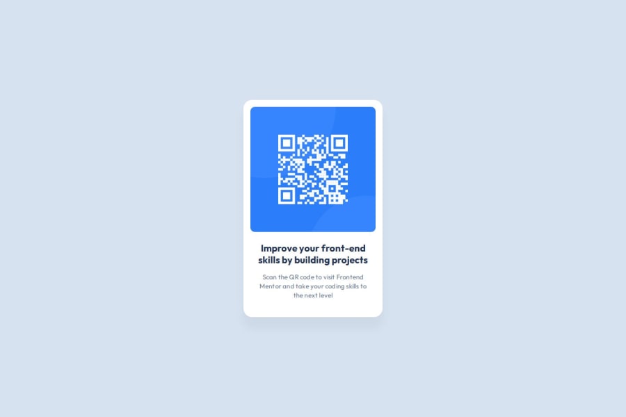
divwrap):<main> <div class="card"> <img src="./assets/images/image-qr-code.png" alt="qr code" loading="lazy"/> <div class="card-content"> <h3>Improve your front-end skills by building projects</h3> <p>Scan the QR code to visit Frontend Mentor and take your coding skills to the next level</p> </div> </div> </main>This approach allows for flexibility, making it easy to add multiple cards with different images and text content as needed.
I typically think of layouts from a component-based perspective, which is why I prefer this method.
For reference, there is a useful example of a card layout at w3school
Thank you for your recommendations and for taking the time to review my work. I appreciate your feedback!
1@Alex-Archer-IPosted 9 months ago@RobertsPeirags
Oh, yeah, I can see now why you need a div here (I would still apply padding for the both text blocks with shared class, but both approached are valid =)).
It's just I'm a used to think about that the browser parse tags into the nested JS objects and we could reduce the load by reducing the tags. But guess it'll be noticeable only with like 100 tags or more =)
Anyway, glad that something from my suggestions came useful =)
1 - @damigandPosted 9 months ago
In my subjective opinion, there's no need for a wrapper div around the image. Using
width: 100%andmax-width: 288px;on the image element should be enough to fit within the flexbox div without a parent wrapper. If you want to ensure that the image remains a square, consider usingaspect-ratio: 1 / 1;as well.Keep in mind though, I don't think there's any difference between just the image element or an image within a wrapper element, it simply takes less time and effort if you use css properties on the image directly.
Your solutions looks pretty much identical, amazing job!
1@indaqooPosted 9 months ago@damigand Thank you for taking the time to review my work. I appreciate your feedback!
1


Please log in to post a comment
Log in with GitHubJoin our Discord community
Join thousands of Frontend Mentor community members taking the challenges, sharing resources, helping each other, and chatting about all things front-end!
Join our Discord