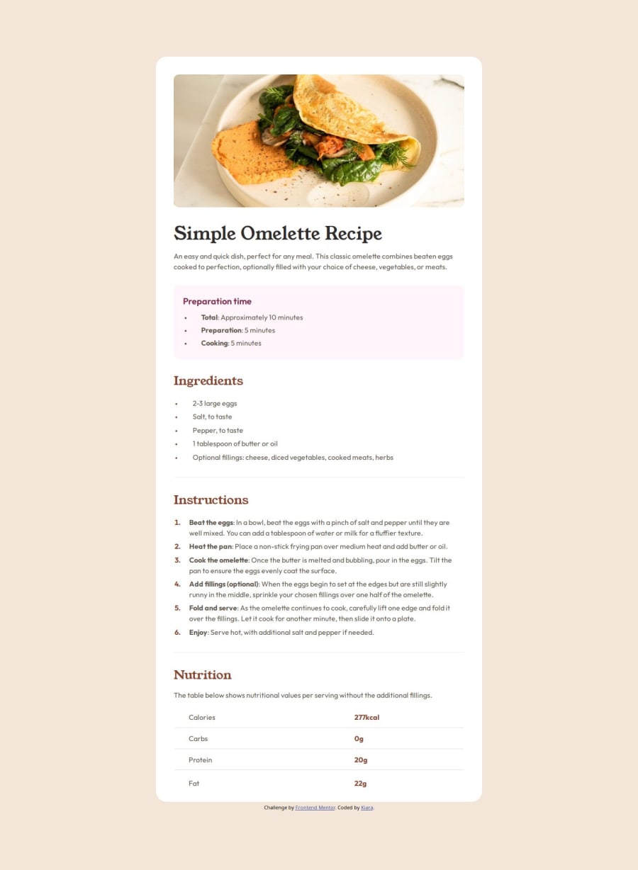
Design comparison
Solution retrospective
I'm getting better at organizing the work flow. There is always room for improvement.
What challenges did you encounter, and how did you overcome them?It was fun to style the ul and ol. It was a bit challenging to figure out how to make space between the dots and the list item. I've found a very useful resource at "css-tricks.com" website.
What specific areas of your project would you like help with?I'd like to implement my code with more responsiveness without having to write long media queries. I know that using a clamp() function could help. Any suggestion on other technics that I can study to implement responsiveness are welcome! FEEDBACKS on how to organize the css file better so it is more readable and also I'd like feedbacks on naming classes...are mine too generic?
Community feedback
Please log in to post a comment
Log in with GitHubJoin our Discord community
Join thousands of Frontend Mentor community members taking the challenges, sharing resources, helping each other, and chatting about all things front-end!
Join our Discord
