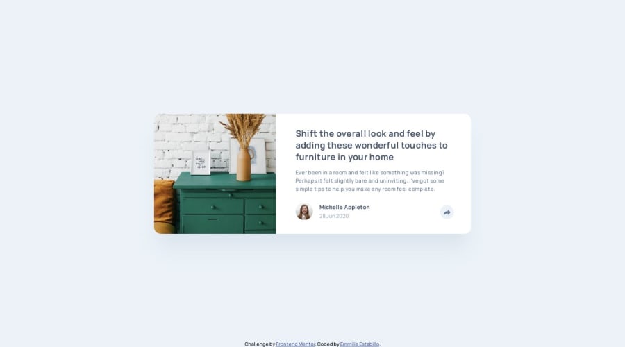
Pure CSS solution with hover/active effects
Design comparison
Solution retrospective
I tried to apply border-radius: 1.5rem
to the main
tag but it didn't work. Had to individually target every corner. Why is that? Any kind of feedback is welcome.
Community feedback
- Account deleted
Hi.
The issue is because children elements are overflowing so their borders are shown.
The solution is to remove all the
border-radius
that you have and leave it only in the main tag + you must use theoverflow: hidden
property, so children's borders aren't displayedmain { ... border-radius: 1.5rem; overflow: hidden; }
3@emestabilloPosted over 4 years agoHi @juanmesa2097 I've already tried this and it works for the mobile version. The desktop view has that popup that overflows the container, and applying
overflow: hidden
will cut it up to the point of the container's border, which is about half of the popup. Sigh. Thanks for taking a look!0Account deleted@emestabillo you can still use it in the
image-container
main { border-radius: 1.5rem } main .image-container { width: 100%; border-radius: 1.5rem 0 0 1.5rem; overflow: hidden; }
Those would be the only places where you would set the
border-radius
Another possibility could be
background-clip: content-box
but you still need to replicate theborder-radius
in theimage-container
2@emestabilloPosted over 4 years ago@juanmesa2097 Ah I see, this method will also work. Thank you so much!
1Account deleted@emestabillo of course, no problem.
0 - @shashiloPosted over 4 years ago
Emmilie, this looks exactly like the design. I can't even tell the difference! Great job! I did find a few areas of improvement besides the border-radius.
- The hover states should transition together. Currently, on desktop, when you hover on the CTA, the shared bubble transitions a little later. Onmouseleave, the button transitions quickly and before the shared button. There's no cohesion right now.
- Missing content
box-shadow
. - The CTA doesn't work well on mobile. Either use an input button and make it pure CSS or use Javascript to toggle the states as the mobile user clicks on the CTA.
2@emestabilloPosted over 4 years agoHi @shashilo , great eye as usual! Will you be my mentor?? 😄 You're absolutely right about the CTA. I tried to be slick, and I paid the price lol. I'll revisit the project to include all above comments. Thank you so much!
0 - @rfilenkoPosted over 4 years ago
Hey, generally setting border-radius and overflow:hidden on parent container works, but for popup you probably need to use js, coz on mobile hover wouldn't work. Nice solution though
Cheers, Roman
2@emestabilloPosted over 4 years agoHi @rfilenko , good point! The hover states wasn’t originally called for in the style guide but I added it anyway. The popup active state, on the other hand, doesn’t remove itself once applied on mobile..and that I might have to adjust by js. Thank you for the comment!
1 - @tarasisPosted about 4 years ago
Near pixel perfect, love it Em!
Main thing I see behaviour wise is that the share icon often doesn’t return to the base Color when dismissed. It stays darker grey with white. (On my iPad, where I do most of my browsing)
(Aside I wish your current mentor score was 1701 rather than 1710 🖖)
1@emestabilloPosted about 4 years ago@tarasis Haha 🖖🏼🖖🏼 Good catch! I’ll add it to the list 👍🏼 Thank you for the feedback!
0 - @En-JenPosted about 4 years ago
Hi Emmillie, really nice solution!! Basically pixel perfect 👌 Really nice, organized, readable code too. I'll have to study more of your projects to learn some things from you! I just have one super minor suggestion for something you could fix. It looks like on a small mobile screen size like an iPhone 5, the attribution overlaps with the content on the page.
1@emestabilloPosted about 4 years ago@En-Jen Hi Jen, I call that my trademark lol :grin: For single component challenges like this, my attributions are positioned fixed that's why it will always overlap with smaller viewports. It's something I'd really have to do something about. Thank you for the feedback!
0 - @alicepsz98Posted over 4 years ago
Tente com px, em vez de rem.
0@emestabilloPosted over 4 years agoHi @alicepsz98 , thanks for the feedback! I wish the answer were that easy 🙂
border-radius
can actually take both percentage and length values (such as px and rem).0
Please log in to post a comment
Log in with GitHubJoin our Discord community
Join thousands of Frontend Mentor community members taking the challenges, sharing resources, helping each other, and chatting about all things front-end!
Join our Discord