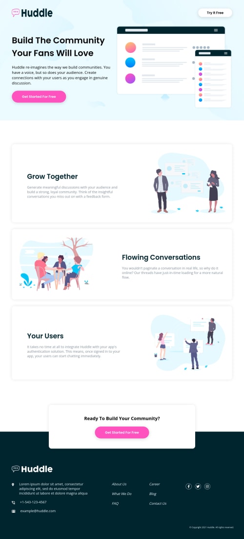
Project 12: Huddle landing page using Sass, Flexbox
Design comparison
Solution retrospective
Waiting for your vital feedback...
Community feedback
- @pikapikamartPosted about 3 years ago
Hey, awesome work on this one. Desktop layout looks great, the text are just bigger, the site is responsive and the mobile state looks great as well.
Fidel Lim already gave great tip on this one, just going to add some suggestions on this as well:
- I wouldn't include the website-logo inside the
nav
since it is not being treated as a home-link. - Website-logo
img
should be using the website's name as thealt
likealt="huddle"
. Remember that a website's logo is meaningful so always make sure it uses the properalt
value. - On the
buttons
or just any other interactive elements, if you remove theoutline
property of an element, make sure to add another custom visual indicator on the element's:focus-visible
state. Try using tab on your keyboard to navigate the site, you will have a hard time since there is no indication on where you at. - Hero-section image is just a vector-decoration so hide it. Decorative image must be hidden at all times by using
alt=""
and extraaria-hidden="true"
attribute on theimg
tag. - When wrapping a text-content do not just use
span
to wrap it, use meaningful element like ap
tag if it just a regular text or heading tag if it is an heading. - Other images are just same vector-decoration so hide it using the method I mentioned above.
FOOTER
- I wonder why the website-logo in here is using a proper
alt
unlike the header-website-logo. - The icons below the website-logo could have use an extra
aria-hidden="true"
attribute so that they will be totally hidden alongside with thealt=""
- The 6 links should be inside a single
nav
element and not separated since those are all related to one another. Useul
as well for those since those are "list" of links. - Social media links could be inside
ul
since those are "list" of links. - Each
a
tag that wraps social media, it should have eitheraria-label
attribute or screen-reader element inside it. The value for whatever method you will use should be the name of the social media likearia-label="facebook"
on the facebook linka
tag. This way, users will know where this link would take them.
Aside from those, great work again on this one.
Marked as helpful2@Mainul-Islam-NirobPosted about 3 years ago@pikamart Many many Thanksπππ
1 - I wouldn't include the website-logo inside the
- @fidellimPosted about 3 years ago
Hi Mainul,
Great work finishing the project. It looks great for mobile and desktop views. One suggestion I would like to share is the logo of your navigation. It seems to be stretch vertically. One way to fix this issue is by adding
align-items: center
. With this, all items within the container will be centered on the y-axis. You can check this code:body .header .navigation { display: flex; justify-content: space-between; align-items: center; padding: 5rem 7rem 0 7rem; }
I hope it helps :)
Marked as helpful1@Mainul-Islam-NirobPosted about 3 years ago@fidellim Thank you so muchπππ
1
Please log in to post a comment
Log in with GitHubJoin our Discord community
Join thousands of Frontend Mentor community members taking the challenges, sharing resources, helping each other, and chatting about all things front-end!
Join our Discord