Progresive Enhancement, Typescript, Postcss
Design comparison
Solution retrospective
I practice progressive enhancement.
What challenges did you encounter, and how did you overcome them?I don't show the button if the browser doesn't have JavaScript enabled and display the menu by default.
What specific areas of your project would you like help with?Any feedback it's welcome
Community feedback
- @grace-snowPosted 5 days ago
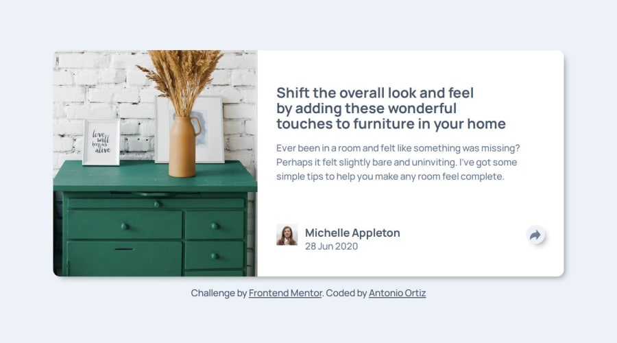
Hi, good solid effort on this. It's a hard challenge, definitely more complex than it first looks because of the different UIs in mobile and desktop. There are quite a few problems though, and it looks very different to the design. Much much larger, for example and no radius on the avatar.
I wouldn't say the progressive enhancement has worked correctly either. The popup content is visible by default without JS but definitely should not be styled like that. It's overlapping content in some views and really odd to make it look like a popup still. And on mobile view it is covering the card footer, which is very bad. You need to ensure all content looks and functions correctly if offering a no-JS base version.
Other issues I notice
- There's no CSS reset which is causing unnecessary additional scroll.
- The focus order is incorrect. The popup content must come after the button, because you've triggered it. But currently when I open it the next focusable item is in the footer.
- Personally, I would follow a non-modal dialog pattern for this using the default HTML
dialog
element instead of what you have here that's following more of a disclosure pattern. See https://developer.mozilla.org/en-US/docs/Web/HTML/Element/dialog - The aria-label should start with "Share" not "open". E.g.
aria-label="Share toggle"
. - The toggle button has no visible focus outline when open on mobile because it's the same colour as the background. I would also give it a little outline-offset.
- The ul is NOT a menu role! All of the roles in this need removing. This is a list of links, nothing else. It doesn't need any special treatment at all.
- The capitalised SHARE text is a heading (h3)
- The inline SVGs need to be
aria-hidden="true" focusable="false"
. - The way you're using paddings and margins on this is rather strange to be honest. The white area should have padding on all sides. The content inside it only needs vertical margins, and gap in the case of the card footer. This has been over-complicated.
- Did this challenge only come with one main image? I would have expected some art direction with two images in a picture element, but maybe this challenge only has the one image... I would at least expect the mobile version to have a max-height and not an aspect ratio of 1.
- Don't forget hover styles.
Marked as helpful2
Please log in to post a comment
Log in with GitHubJoin our Discord community
Join thousands of Frontend Mentor community members taking the challenges, sharing resources, helping each other, and chatting about all things front-end!
Join our Discord