Design comparison
Solution retrospective
Yeah, I think I overcomplicate stuff by just overthinking everything especially with BEM. Any advice will be greatly appreciated.
Community feedback
- @tedikoPosted over 3 years ago
Hello, Michelle! 👋
Congrats on finishing another challenge! Your BEM doesn't look bad but there is room to improve. You don't have to using same names for every element in your block. For example your
.card__info
can be named.card__wrapper
and then you can change.card__info__content
for.card__content
and within that element.card__content__img
. Then you'll be havecard__content__info
and insidecard__content__heading
andcard__content__text
. Same goes for next element. I suggest you to read again about BEM, you're on good path tho. And make sure you understand modifiers good, because you're using it wrong in this case.Good luck with that, have fun coding! 💪
1@mcdulingmPosted over 3 years ago@tediko thanks for the kind words. It's very encouraging. Even though I used it wrong, I never would have known if I haven't posted it. I was looking at your profile yesterday, and I was so inspired. Hope I can get as good as you. :)
0@tedikoPosted over 3 years ago@mcdulingm One step at the time, we are all learning here :) Thank you for kind words, it's nice that my work inspired you. Keep working and you'll see fast progress.
0 - @shashankrk46Posted over 3 years ago
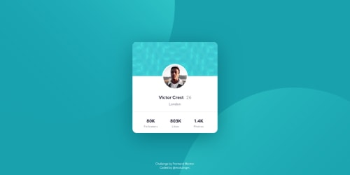
hey i was figuring out how to place those circle at left top corner and bottom right corner tried rotate but nothing seems to work saw your code it make sense to use those position property thanks.
0
Please log in to post a comment
Log in with GitHubJoin our Discord community
Join thousands of Frontend Mentor community members taking the challenges, sharing resources, helping each other, and chatting about all things front-end!
Join our Discord