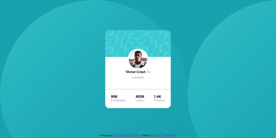
Profile card component by Jaime Trovoada
Design comparison
Solution retrospective
would like some help/feedback with the card sizing and rotating the background image
Community feedback
- @JessicaStrachanPosted almost 4 years ago
Nice work Jaime :)
Some feedback on the body background images: On line 13 of style.css, you're actually overwriting the line before, they're essentially the same thing, and you're seeing two of those background circles because the background images gets repeated by default. You can prevent this with
background-repeat: no-repeat.In order for these circles to be treated as separate elements you could either put them in separate divs with unique classes and then you will be able to rotate those individual elements with
transform: rotate(90deg)for example. However I think these assets are supplied the same as the design so I don't believe you should need any rotating in this case.I would also suggest using classes instead of ids. Ids have high specificity than classes, and whilst it's not incorrect, you could cause yourself future problems in more complex styling with specificity wars or finding the need to use
!importantto override styles which isn't recommended.1 - @PhantomOzPosted almost 4 years ago
On mobile, you have to reduce the font-size of the followers, likes, and photos. You can also add some margin between them
0
Please log in to post a comment
Log in with GitHubJoin our Discord community
Join thousands of Frontend Mentor community members taking the challenges, sharing resources, helping each other, and chatting about all things front-end!
Join our Discord
