Design comparison
SolutionDesign
Solution retrospective
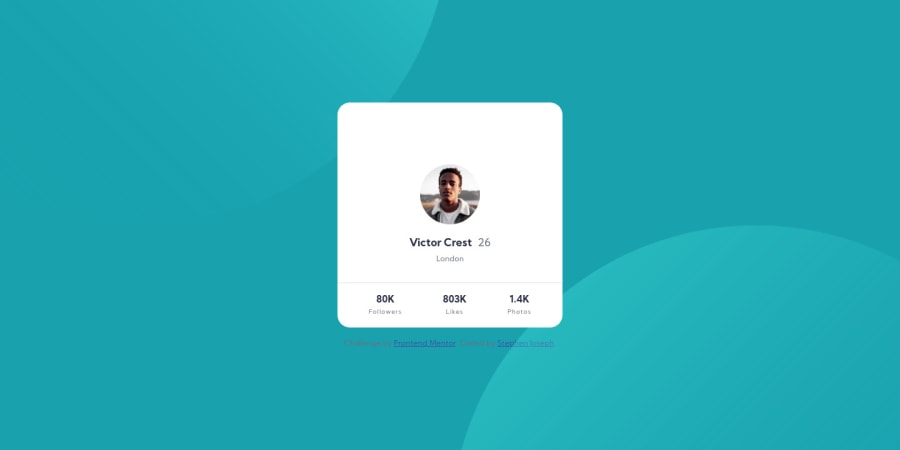
Hello, this is my 3rd project. Just wanna ask if there's a better way of placing the elements in the card especially the user img I only used margin for it. Otherwise, any feedback is appreciated.
Community feedback
- @brkclnPosted about 3 years ago
Hello there, Thanks for the post. You need a little more basic knowledge of "FLEXBOX" and "GRID". You can use flexbox for the "layout"
- DONT margin, padding on "img" its not a good practice. Use them on wrapping div.
<div> <img src=""> </div> style div { margin padding height } img { width: 100% or max-width: 100% height: auto object-fit :cover // search this. }
You can use like this better practice.
- try to avoid "setting height" not a good practice do it with padding,flexbox,grid etc. (just use it if necessary)
- Search "absolute position" it can help you.. Keep working.
Marked as helpful1@stephmunezPosted about 3 years agoGot it @brkcln. Thanks for the feedback, will take note of those and update the code asap!
0@brkclnPosted about 3 years ago@sjtmunez No problem, you just need time and search. Not so hard ^^ good luck
0
Please log in to post a comment
Log in with GitHubJoin our Discord community
Join thousands of Frontend Mentor community members taking the challenges, sharing resources, helping each other, and chatting about all things front-end!
Join our Discord