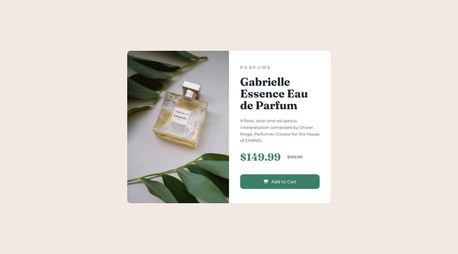
Product preview card using HTML and CSS
Design comparison
Solution retrospective
Hi !
I'm pretty happy with this code. The colors aren't the same as the ones put in the style-guide because I thought they weren't the same as the design. Weird.
Hope you can give me some feedbacks !
Thanks in advance :)
Community feedback
- @rayaattaPosted 10 months ago
Hello there 👋. Congratulations on successfully completing the challenge! 🎉
I have other recommendations regarding your code that I believe will be of great interest to you.
1 It is much more recommended to link to your fonts inside your html instead of importing them in the CSS.
2
The PiCTURE TAG 📸:
Looks like you're currently using media queries for swapping different version of image by setting up their display property in CSS, So let me introduce the picture element. The
<picture>tag is commonly used for responsive images, where different image sources are provided for different screen sizes and devices, and for art direction, where different images are used for different contexts or layouts. Example:<picture class="image-container"> <source srcset="images/image-product-desktop.jpg" media="(min-width: 600px)"> <img src="images/image-product-desktop.jpg" alt="a picture showing a bottle of perfume"> </picture>In this example, the
<picture>tag contains two child elements: one<source>element and an <img> element. The<source>elements specifies different image sources and the conditions under which they should be used. Using this approach allows you to provide different images for different screen sizes without relying on CSS, and it also helps to improve page load times by reducing the size of the images that are served to the user If you have any questions or need further clarification, you can check out this articleI hope this helps 😄
Happy coding!🙃
Marked as helpful0@a-fox-on-the-moonPosted 10 months agoHi @rayaatta !
Thanks a lot for this feedback !
I'm struggling with the picture tag... Is this what I'm supposed to do ? :
        <picture>
          <source
            srcset="images/image-product-desktop.jpg"
            media="(min-width: 660px)"
          />
          <img
            class="desktop"
            src="images/image-product-desktop.jpg"
            alt="a picture showing a bottle of perfume"
          />
        </picture>
        <picture>
          <source
            srcset="images/image-product-mobile.jpg"
            media="(max-width: 660px)"
          />
          <img
            class="mobile"
            src="images/image-product-mobile.jpg"
            alt="a picture showing a bottle of perfume"
          />
        </picture>
  </div>

What do I do with the CSS then ?
0
Please log in to post a comment
Log in with GitHubJoin our Discord community
Join thousands of Frontend Mentor community members taking the challenges, sharing resources, helping each other, and chatting about all things front-end!
Join our Discord
