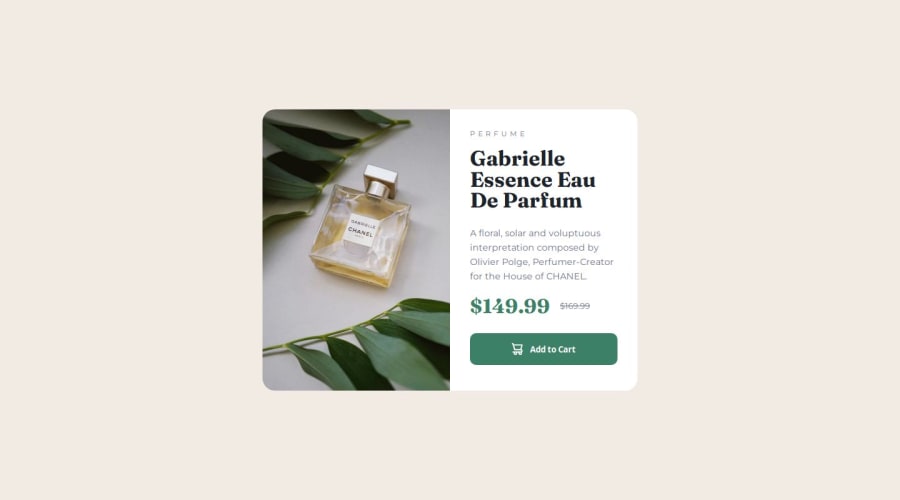
Design comparison
Community feedback
- @Djamel1133Posted about 1 month ago
Hi, I just uploaded a solution for this challenge and I have to give feedback on other solutions (Frontend Mentor requires me to do so to continu my learning path). So here are my little remarks:
- You used
altfor the cart image:
<img src="images/icon-cart.svg" alt="Shopping basket" />I think that is not necessary for more detail (https://web.dev/learn/design/icons?continue=https%3A%2F%2Fweb.dev%2Flearn%2Fdesign#article-https://web.dev/learn/design/icons&hl=fr).
- Your mobile version (I think) is too small:
(max-width: 430px)See other solutions and get an idea on breakpoint thresholds. It’s also recommended to use relative units (e.g., em or rem) when defining breakpoints see (https://www.frontendmentor.io/learning-paths/building-responsive-layouts--z1qCXVqkD/steps/66ec8c0a5832c087f261adec/article/read) and note that it’s recommended to use relative units (e.g., em or rem) when defining breakpoints.)
- Use variables (like you did for colors) also for font-size, spacing, etc.
:root {
  --Dark-cyan: hsl(158, 36%, 37%);
  --font-size-small: 1rem;
  ...
}
I hope this was helpful. See you at the next challenge, well done and keep learning.
Marked as helpful1 - You used
Please log in to post a comment
Log in with GitHubJoin our Discord community
Join thousands of Frontend Mentor community members taking the challenges, sharing resources, helping each other, and chatting about all things front-end!
Join our Discord
