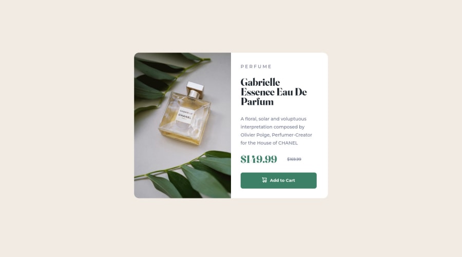
Product Preview Card made with CSS Grid
Design comparison
Solution retrospective
- When I tested it on other phones, it did not use the mobile view but the desktop view. How do I improve with making the mobile view compatible with all mobile screens?
- Is there a better way than using CSS Grid?
- What more can I do to improve my work?
Community feedback
- @SouiciaPosted almost 3 years ago
Hello Jasmine,
First of all, congratulations on your first completed project (just finished my first one too).
For the website to adapt to screen sizes, you should define a max-width in the media query, such as: @media screen and (max-width: 500px) {your code}. This code means that once the screen reaches below 500px, it will apply the changes you wrote in the media query. The min-width option does the opposite, so when the screen reaches above a certain px value, the changes will apply.
For CSS grid, you want to target the biggest parts of the website. For example, in this website, there are two main parts: the picture, and the info about the product. To target those two parts, you should do: display: grid; grid-template-columns: 1fr 1fr; If you select a specific width for this container, like 600px, 1fr will be counted as 300px, thus, each main part of the container will have a clear width. You may as well declare the height as auto for it to automatically adjust to the height of the main parts. By doing all this, when you resize your page, the two main parts will have identical width and height.
Some further tips: You can write content in div without having to declare a <p> nested to it. such as <div class="price> $149.99 </div> and write all the style in the div class. That decreases the amount of classes you will write and improve legibility.
If you want to learn more CSS, look for Kevin Powell (https://www.youtube.com/kepowob) on Youtube. He is a great instructor and really good at CSS.
Marked as helpful1 - @MavreonPosted almost 3 years ago
Hello Jasmine, congratulations on completing this challenge 👏 Check your html code, in the head section for this line of code
<meta name="viewport" content="width=width-device, initial-scale=1.0">... Then make sure you have your media query set up and in it changeflex-direction: columnif you used a flex box orgrid-template-columns: 1frif you used grids. Tweak the other elements to your linking... If you still don't get this, I could share my solution to thus challenge with you... Happy coding 👏🎊PS: Oh it seems you've fixed it, imma just leave this here
1
Please log in to post a comment
Log in with GitHubJoin our Discord community
Join thousands of Frontend Mentor community members taking the challenges, sharing resources, helping each other, and chatting about all things front-end!
Join our Discord
