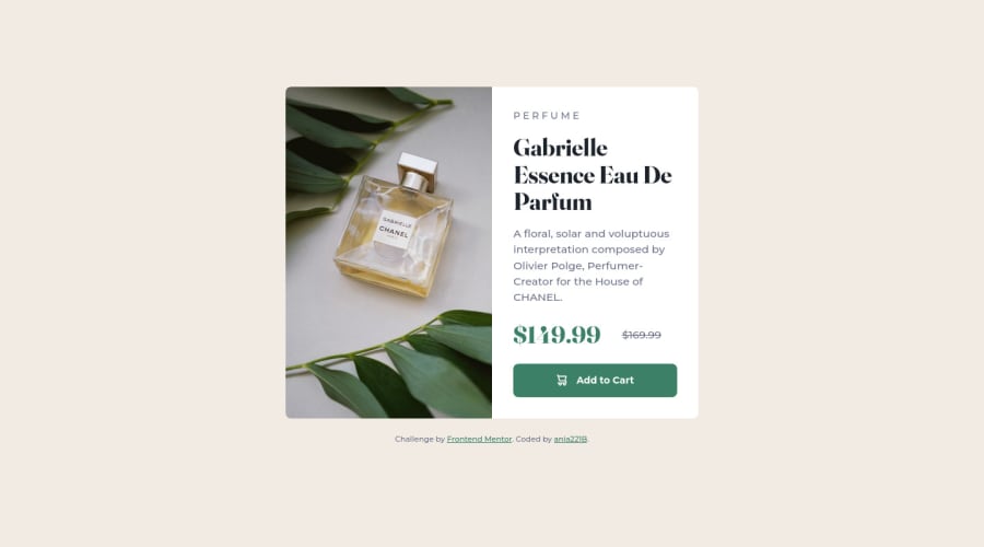
Product preview card component with grid, flexbox and CUBE CSS
Design comparison
Solution retrospective
- There was no hover color in the README file, so I matched the shade the best I could.
- I'm not sure about the "Perfume" text at the top. I decided it is a category of the product and put it in a separate div. I read a bit about double headers while trying to figure out how to approach this. I don't know if my choice was good. Are there any best practices assuming it's separate from the header?
- It seems to me this is too much code for a small component like this, but I don't know how to reduce the volume. Any suggestions?
Community feedback
- @ApplePieGiraffePosted almost 3 years ago
Hi, ania! 👋
Great job on this challenge! 👏 Your solution looks good and responds very nicely! 👍
Given that this card component is a self-contained element that makes sense without additional context from a parent element, it could be an
articleelement, which means it could have aheaderelement inside of it. But since this component is so small and there isn't very much information inside of it, I don't know if adding a header would really make much of a difference. Using apelement like you did is probably just fine.I don't think you have too much code for this solution—it's surprising sometimes how much code you might need for something relatively simple. You might be able to cut a few lines out of your CSS by using a preprocessor such as Sass which will allow you to nest your styles and make your code slightly less verbose.
Hope you find this helpful. 😊
Keep coding (and happy coding, too)! 😁
Marked as helpful2@ApplePieGiraffePosted almost 3 years agoAlso, it might be worth using
remrather thanemin your media queries sinceremwill be a more consistent unit based on the root font size of the entire document whileemwill change based on the font size of the parent element (which may cause confusing results if you happen to use a media query witheminside of an element whose parent's font size has been changed). 🙂Marked as helpful0P@ania221BPosted almost 3 years ago@ApplePieGiraffe Hello! Thank you very much for your feedback and kind comments :) I haven't thought about an <article> but it seems an interesting idea, thank you! As far as the units go, I made my choice based on an ariticle I read. I guess I need to revisit and think it over. BTW, you have an awesome user name :) Thank you again for all the tips and have a great day!
1@ApplePieGiraffePosted almost 3 years ago@ania221B
You're welcome! Glad you found that helpful! 👍
If you'd like to learn more about the
articletag and where and when to use it, check out this great article by CSS Tricks on semantic HTML. I've learned a lot from it, and perhaps you might, too! 😉Have a great day, as well! ☀️
Marked as helpful0
Please log in to post a comment
Log in with GitHubJoin our Discord community
Join thousands of Frontend Mentor community members taking the challenges, sharing resources, helping each other, and chatting about all things front-end!
Join our Discord
