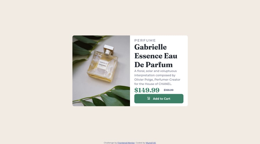
Design comparison
Solution retrospective
Frontend Mentor - Product preview card component solution
This is a solution to the Product preview card component challenge on Frontend Mentor. Frontend Mentor challenges help you improve your coding skills by building realistic projects.
Table of contents
Note: Delete this note and update the table of contents based on what sections you keep.
Overview
The challenge
Users should be able to:
- View the optimal layout depending on their device's screen size
- See hover states for interactive elements
Screenshot
 Active State
 Mobile Design

Links
- Solution URL: Add solution URL here
- Live Site URL: Add live site URL here
My process
Built with
- Semantic HTML5 markup
- CSS custom properties
- Flexbox
Continued development
I am also thinking to make this design in css grid also.On future projects I will try to use CSS Grid and also I will try to use more advance CSS properties.
Useful resources
- InternetingIsHard - This webiste has realy amazing toutorial for html and css. It had explained the topics such with simplicty it is very useful if you want to start with html and css.
- Css Tricks - This is an amazing website for Css-Tricks. Kevin Powell The king of css has explained the CSS-Flexbox and Gridbox in very amazig and easy to learn way.
Author
- Frontend Mentor - @Munsif-Ali
Community feedback
- @VCaramesPosted almost 2 years ago
Hey there! 👋 Here is some feedback to further improve your code:
- The image’s
alt tagdescription needs to be improved upon ⚠️. Assume that you are describing the image to someone over the phone.
More Info:📚
https://www.w3.org/WAI/tutorials/images/
- This component requires the use of two images 🎑 at different breakpoints ⚠️. The
pictureelement will facilitate this.
Here is how it looks like implemented: EXAMPLE
Syntax:
  <picture>
    <source media="(min-width: )" srcset="">
    <img src="" alt="">
  </picture>
More Info:📚
https://www.w3schools.com/html/html_images_picture.asp
- The old price (169.99) 🏷 is not being properly announced 😢 to screen readers. To fix this, you are going to wrap the the price in a
selement and inside it you will add aspanelement with anvisually-hiddenclass that will state something like “The previous price was…” and use CSS to make it only visible to screen readers.
More Info:📚
- Change ⚠️ the
heighttomin-heightin yourbodyelement, to improve your component's responsiveness and remove thewidth: 100vw;as is not needed.
- ALWAYS Implement a "Mobile First" approach 📱 > 🖥
Mobile devices are now the dominant 👑 way in which people browse the web. So when building your content, you will start building with small screen sizes (starting at 320px) and work your way to larger screens using
min-width.More Info: 📚
If you have any questions or need further clarification, you can always check out my submission and/or feel free to reach out to me.
Happy Coding! 👾
Marked as helpful1@Munsif-AliPosted almost 2 years ago@vcarames Thank you so much for your valuable feedback. I will definitely checkout the resource you mentioned and still i am learning how to make good design i will be more than happy if you give me good resources for that.
I want to ask one question your product preview card is different you make it by yourself or this is other challenge?
Thank you so much.
0@VCaramesPosted almost 2 years ago@Munsif-Ali
Glad I could help!
It is the same challenges as yours, I just modified it.
0 - The image’s
Please log in to post a comment
Log in with GitHubJoin our Discord community
Join thousands of Frontend Mentor community members taking the challenges, sharing resources, helping each other, and chatting about all things front-end!
Join our Discord


