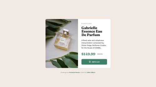
COMPONENT - Product Preview Card

Solution retrospective
Reflecting on the project, I am particularly pleased with how I implemented responsive design principles to ensure the product preview card component functions seamlessly across diverse devices. This involved using flexible layouts and media queries to adapt the interface from mobile screens to larger desktop displays, enhancing user accessibility and interaction.
What challenges did you encounter, and how did you overcome them?One of the main challenges I faced was mastering the element for loading different-sized images based on media queries, requiring focused learning and experimentation to integrate effectively into the project.
What specific areas of your project would you like help with?I don’t need help with any specific areas of my project at the moment.
Please log in to post a comment
Log in with GitHubCommunity feedback
No feedback yet. Be the first to give feedback on Julien Gilbert's solution.
Join our Discord community
Join thousands of Frontend Mentor community members taking the challenges, sharing resources, helping each other, and chatting about all things front-end!
Join our Discord