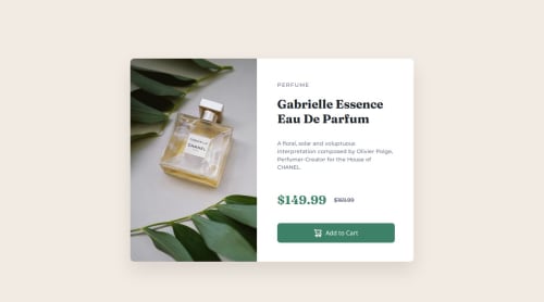
Design comparison
Solution retrospective
my understanding improves
What challenges did you encounter, and how did you overcome them?The challenge was to fully understand the structure of the problem in order to facilitate its design. At first, it seemed simple and easy, but then you realize all the details that need to be taken into account. I had to work hard to improve in this area.
What specific areas of your project would you like help with?better understanding of css, read more documentation
Community feedback
- @Islandstone89Posted about 2 months ago
Hi Aury, well done!
My suggestions:
HTML:
-
In this challenge we have two versions of the product image, dependent on the screen size. Hence, we must use the
<picture>
element. -
You should not include words like "image" in the alt text, as screen readers will recognize images by default.
-
The prices are not headings, so change both to
<p>
. -
Currently the old price is shown via a strike-through, but how would screen readers understand that it's the old price? Therefore, I would wrap the second price in a
<span class="visually-hidden">Old price: </span>
. To make "old price" disappear visually, while not hidden from screen readers, add the following CSS:
.visually-hidden { clip-path: inset(50%); position: absolute; overflow: hidden; white-space: nowrap; width: 1px; height: 1px; }
I like to refer to this article that explains what each of these properties does.
-
The cart icon is purely decorative, so the alt text should be empty:
alt=""
. -
.attribution
should be a<footer>
, and you should use<p>
for the text inside.
CSS:
-
Including a CSS Reset at the top is good practice.
-
I recommend adding
1rem
ofpadding
on thebody
, to ensure the card doesn't touch the edges on small screens. -
I would move the properties on
main
to thebody
, so you can also center the footer.main
doesn't need any styles, so remove that selector. You need to changeheight
tomin-height
- this way, the content will not get cut off if it grows beneath the viewport. Also addflex-direction: column
(the default value ofrow
would push the footer besides the card, not underneath) and agap
of around2rem
. -
max-width
on the card must be in rem. -
On
.perfume-text
, removepadding-left :150px
- that space can come from thegap
on the parent, which is the card itself. -
Change
width: 150%
towidth: 100%
on the image, so it doesn't overflow into the text section. -
font-size
must never be in px. This is a big accessibility issue, as it prevents the font size from scaling with the user's default setting in the browser. Use rem instead. -
letter-spacing
must also not be inpx
. You can useem
, where1em
equals the element's font size. -
For this layout, I would use Grid instead of Flexbox. The mobile styles should be the default, so I would add this to the card:
display: grid; grid-template-rows: auto auto; gap: 2rem;
Which changes to this on larger screens:
grid-template-columns: 1fr 1fr; grid-template-rows: auto;
Good luck :)
Marked as helpful2 -
Please log in to post a comment
Log in with GitHubJoin our Discord community
Join thousands of Frontend Mentor community members taking the challenges, sharing resources, helping each other, and chatting about all things front-end!
Join our Discord