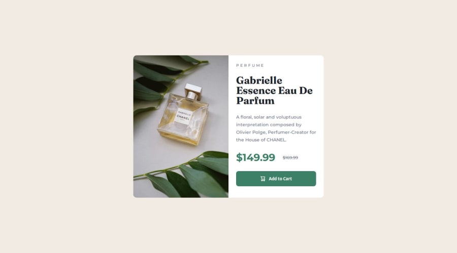


Design comparison

Solution retrospective
Having used css grid, even it's in it prob easiest config.
What challenges did you encounter, and how did you overcome them?Took a while until I got the responsiveness working in a decent way.
What specific areas of your project would you like help with?Any input is appreciated.
Community feedback
- @Mirjax2000Posted about 1 year ago
target your break point somewhere around 650px even more is all right, at that width are tablets and and wide mobilephones. Bellow that your layout is broken.
excelent, you use picture element and made resolution switching, with magnificient alt.
you can insert svg into img element. or in other container. it is a cleaner solution. If you have complex svg with lots of code, your html will look like hell.
if you making
.product-card__btn:hover {}you must add :focus as well, you can controlit with your tabelator on your keyboard and you dont need mouse.
.product-card__btn:hover,
.product-card__btn:focus {}
There are still fixed values in px, and lots of heights again. You dont need heights at all. Later on when you will work with javascript it will make you trouble.
margins in px is also better with em units. But you need to know how to calculate them. It is little bit tricky. there is formula target/context= EM. target is size in px and context is your font size in px. then when you switch font size in all HTML everything will change automaticly, and you can make only one change on one place, this is usefull on breakpoints and also when some user have different font size in their borwsers. Higher then 16px.
rest is perfect, you know what to do.
good night.
Marked as helpful1 - @ShaunPourPosted about 1 year ago
For the most part, this is an excellent recreation of the design, however, as the below consists of two media queries for the same min-width value, they could be consolidated into one to reduce the overall size of the css file slightly and prevent repetition.
@media (min-width: 376px) {
	.product-card__header {
		margin: 24px 0px;
		line-height: 3.2rem;
	}
}

@media (min-width: 376px) {
	.product-card__text {
		line-height: 2.4rem;
	}
}
So, the above could become this:
@media (min-width: 376px) {
	.product-card__header {
		margin: 24px 0px;
		line-height: 3.2rem;
	}
      .product-card__text {
		line-height: 2.4rem;
	}
}
Also, as a minor sidenote, having the media queries in the middle of the css file makes it somewhat confusing to read. I would recommend relocating these to the bottom and having them be the last thing in that file instead.
Marked as helpful0


Please log in to post a comment
Log in with GitHub
Join our Discord community
Join thousands of Frontend Mentor community members taking the challenges, sharing resources, helping each other, and chatting about all things front-end!
Join our Discord