Design comparison
SolutionDesign
Solution retrospective
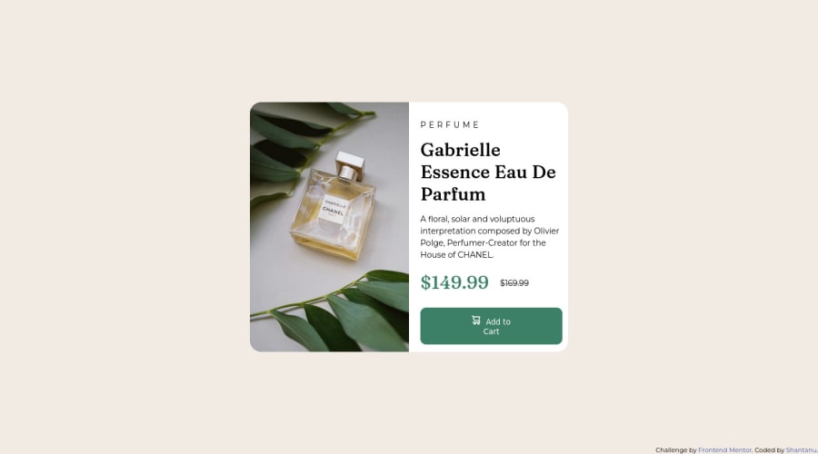
The project was a challenging experience, especially in terms of creating a responsive design that adapts to different screen sizes and devices. I had to put in a significant effort to center the content both vertically and horizontally. I also made use of media queries to ensure optimal display across various devices.
Community feedback
- @Tux3er-IsmaPosted almost 2 years ago
Hi Shantanu
I have reviewed your code and looks nice 🎉:
There are some tips for your next project 💡:
Author ©️:
- Put who did the project or anyone can copy and paste your code. Put it in the
<footer></footer>section of your web page too get a better semantic
CSS 🎨:
- Put more bolder in your text like titles or like the price
font-weight: 600;
That's all. Have a nice coding and continue doing challenges 👨🏻💻!!!
Marked as helpful0 - Put who did the project or anyone can copy and paste your code. Put it in the
Please log in to post a comment
Log in with GitHubJoin our Discord community
Join thousands of Frontend Mentor community members taking the challenges, sharing resources, helping each other, and chatting about all things front-end!
Join our Discord
