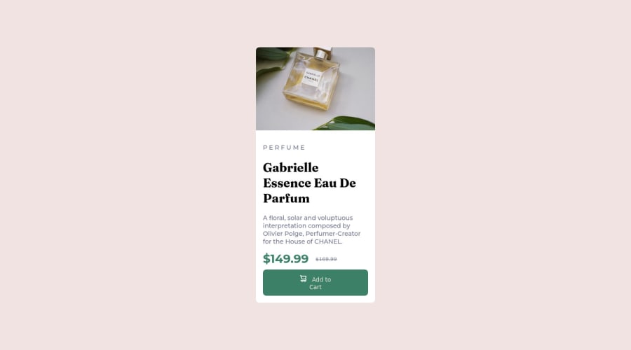
Product preview card component
Design comparison
Solution retrospective
Well this is a simple project and i had fun while doing it but i had some issues while working on it, especially with the fonts i couldn't even tell if it changed because when i embedded the fonts into my css tho it changed the look but i wasn't looking exactly like what i was given to work on, like the price tag wasn't even alike. Also, the spacing between my paragraph and the header was wider than the one given to me even without me adding a margin or padding
Community feedback
- P@ania221BPosted over 2 years ago
Hello @GreatNation111👋
You've mentioned that the spacing between the paragraph and header is bigger than you wanted. This might be due to
line-heightset on<h1>. I think currently it is the same as for the rest of text content. It is worth decreasing it, as smallerline-heightmakes big text look better. Try changing it to 1.2 or similar value and see if it helps. Happy coding 😊Marked as helpful0 - @correlucasPosted over 2 years ago
👾Hello @GreatNation111, Congratulations on completing this challenge!
Your solution its almost done and I’ve some tips to help you to improve it:
Instead of using
IDto give style to your elements, useCLASSthat’s better, note that withidthese styles are not reusables, so prefer to useIDforms and Javascript andCLASSfor styling.It is not advisable to use IDs as CSS selectors because if another element in the page uses the same/similar style, you would have to write the same CSS again.Use the THE PICTURE TAG that is a shortcut to deal with the multiple images in this challenge. So you can use the
<picture>tag instead of importing this as an<img>or using a div withbackground-image. Use it to place the images and make the change between mobile and desktop, instead of using adivorimgand set the change in the css withdisplay: nonewith the tag picture is more practical and easy. Note that for SEO / search engine reasons isn’t a better practice import this product image with CSS since this will make it harder to the image. Manage both images inside the<picture>tag and use the html to code to set when the images should change setting the devicemax-widthdepending of the device desktop + mobile.Check the link for the official documentation for
<picture>in W3 SCHOOLS:https://www.w3schools.com/tags/tag_picture.aspSee the example below:
<picture> <source media="(max-width:650px)" srcset="./images/image-product-mobile.jpg"> <img src="./images/image-product-desktop.jpg" alt="Gabrielle Parfum" style="width:auto;"> </picture>👨💻Here's my solution for this challenge if you wants to see how I build it: https://www.frontendmentor.io/solutions/product-preview-card-vanilla-css-and-custom-hover-state-on-hero-85A1JsueD1
✌️ I hope this helps you and happy coding!
Marked as helpful0@GreatNation111Posted over 2 years ago@correlucas wow thanks so much i really love your feedback
0
Please log in to post a comment
Log in with GitHubJoin our Discord community
Join thousands of Frontend Mentor community members taking the challenges, sharing resources, helping each other, and chatting about all things front-end!
Join our Discord
