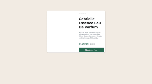
Solution for "product preview cart component" using html and css
Design comparison
Solution retrospective
can u pls tell me what i was doing wrong ? i couldnt make the page responsive .
Community feedback
- @nuribugraPosted almost 2 years ago
Hi Barış,
You couldn't make responsive for this site. Because, you didn't add true media query codes.
For example. In the responsive design, you should change the picture position. Picture must be top of the card content. Therefore, you should add this codes:
#box-1 { display: block; /* flex-direction: column both are possible*/ }
0@brspktsPosted almost 2 years ago@nuribugra thanks Bugra . i made the change , but only content of the box-1 removed to bottom left not the box-1 (container) . what do cause of this ?
0@nuribugraPosted almost 2 years ago@brspkts Your codes have too many mistakes. But, don't be sad, mistakes are the best teacher .I made some changes.
First of all, on the bottom you can see your mistakes:
- You don't have to these codes for adding google fonts libraries
<link rel="preconnect" href="https://fonts.googleapis.com"> <link rel="preconnect" href="https://fonts.gstatic.com" crossorigin> <link href="https://fonts.googleapis.com/css2?family=Montserrat:wght@500;700&display=swap" rel="stylesheet"> <link href="https://fonts.googleapis.com/css2?family=Fraunces:opsz,[email protected],700&family=Montserrat:wght@500;700&display=swap" rel="stylesheet">
- Just this codes is enough (You should add this codes on style.css):
@import url('https://fonts.googleapis.com/css2?family=Fraunces:opsz,[email protected],700&family=Montserrat:wght@500;700&display=swap');
This method is more useful than yours
- There are syntax error on the style.css
@media (max-width:600px){ #box-1{ height: 90%; display: flex flex-direction: column; margin: 0 30px; }
- You forgot to put ";" after "display:flex".
- You don't need "display:flex" code in the media quaries. You have already written before
- In responsive design, you can't see the parfume picture for mobile. You should add both picture on the original html codes and you should use "display: none". (This method is easier than yours.)
HTML:
<div id="box-1"> <div id="box-2" class="jpg"> <img class="product-image-mobile" src="images/image- product-mobile.jpg" alt="parfume mobile"> <img class="product-image" src="images/image-product- desktop.jpg" alt="parfume"> </div> <div id="box-3">
CSS:
.product-image-mobile { display: none; } @media (max-width: 600px) { .product-image-mobile { display:block; } }
This changes will solve your many problems. I'm sure you will be better developer. Keep coding!
0 - @DonUggioniPosted almost 2 years ago
Hey there,
I think your problem might be in your media query code:
@media (max-width:650){ #box-1, #box-2, #box-3{ width: 100%; height: auto; } }
You're not specifying the units on your max-width and I think it should be
@media and (max-width: 650px)
.Also, you could change flex box direction to column when it reaches that media query, to make it adapt to screen size.
0
Please log in to post a comment
Log in with GitHubJoin our Discord community
Join thousands of Frontend Mentor community members taking the challenges, sharing resources, helping each other, and chatting about all things front-end!
Join our Discord