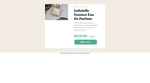
Not Found
Not Found
Not Found
Not Found
Not Found
Not Found
Not Found
Not Found
Not Found
Not Found
Not Found
Not Found
Not Found
Not Found
Not Found
Not Found
Not Found
Not Found
Not Found
Not Found

Submitted

Responsive product card, tried to use img scrset

Karin Lee 50

@kleeblattdev

Desktop design screenshot for the Product preview card component coding challenge

This is a solution for...

  • HTML
  • CSS
1newbie
View challenge

Design comparison


SolutionDesign

Solution retrospective


It would be really helpful, if someone could try to explain me how to use the img srcset, because it does not work. I looked it up on mdn and thought that I build it like the example...

Community feedback

Tux3er 780

@Tux3er-Isma

Posted

Hi Karin Lee,

There are some tips for your next project:

Only use vh for body and when you are doing flexbox, but don't use vh for putting margin between elements use px or rem.

margin: 10px

In Github when you are doing your Readme.md file custome it. This will increase your followers and make you more popular.

Also use the same height as the container in the img because it doesn't look good when you don't put the exactly height.

.container{ height: 400px; } .img{ height: 400px; }

Continue coding!

0

@maxibrain4

Posted

use this example you should get it from there (insert your image url) <picture>

<source media="max-width: 600px" srcset="/images/image-header-mobile.jpg" /> <source media="min-width: 600px" srcset="/images/image-header-desktop.jpg" /> <img src="/images/image-header-mobile.jpg" class="pix" alt="" />
      </picture>
0

Please log in to post a comment

Log in with GitHub
Discord logo

Join our Discord community

Join thousands of Frontend Mentor community members taking the challenges, sharing resources, helping each other, and chatting about all things front-end!

Join our Discord