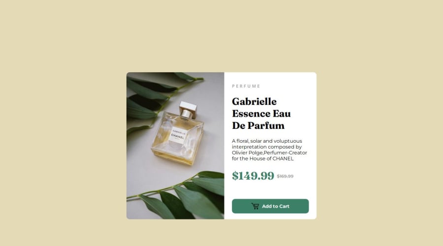


Design comparison

Solution retrospective
I couldn't do the mobile website, I was totally lost about what to do,even with help of ChatGPT I could't. I really have to learn about webdevelopment... And for some reason, in the screenshot the size of product part is uneven, IDK how to solve this, because apparently there's no problem with the code, but on the site it's different from the screenshot
Community feedback
- @hitmorecodePosted 4 months ago
Nice well done. I took a look at your markup and css and these are the issues I've found.
- The reason why the image is resizing this way is because you used
height: 50vh;. This is like telling the image to be 50% of the viewport, so whenever the the viewport gets smaller so will the image. To fix this give.carda fixed width and height in pixels, rem, or em. For examplewidth: 600px;andheight: 478px;. Make the left side 300px and the right side 300px. - Why do you have a
<div class="Btn">inside<div class="Btn-Card">? It also came to my attention that you are using way to many div's. Avoid using this many layers of div's. - Avoid using two
h1on the same page. A page can only contain oneh1element. - Avoid doing this;
With this you are telling the page to apply this
background color to every element on the page.
This is causing issues on your page and to fix it you are
adding background color on every element you have on the page.
This gives you unnecessary extra work.

// don't do this
* {
    background-color: rgb(228, 219, 182);
}

With this you apply the background color on the body not
including the elements.
// do this
body {
    background-color: rgb(228, 219, 182);
}
With this you are telling the page to apply this background color to every element on the page. This is causing issues on your page and to fix it you are adding background color on every element you have on the page. This gives you unnecessary extra work.
- To make the page responsive, you need to use media query and set different css rules for mobile and desktop.
- Make it a good habit applying CSS reset on your pages. Here is a simple CSS reset
* {
  margin: 0;
  padding: 0;
  box-sizing: border-box;
}
I hope you find this helpful and if you need any help regarding this let me know. Keep it up👌👍
Marked as helpful0@pedrolacombePosted 4 months ago@hitmorecode thanks for your feedback and support. I could fix the issues I had. About your question, I had to add the div class=Btn because I couldn't find a way to make the button work without this DIV, but I will try to avoid use to many Div's, like you said. And I add a reset Css on the page.
0@hitmorecodePosted 4 months ago@pedrolacombe I've created a fork of your file and did some changes. It's not perfect but you can use this as a direction.
Looking closer to what you did I have a few more tips.
- When naming classes or id's use lower case only. Instead of class="FullPrice" you can do something like this class="full-price" or "class="full_price".
- Avoid using one letter to name a class or id. You have a class named ".P", stop doing this.
- Your page is not responsive, do your research on media queries, this will help you make a page responsive.
Marked as helpful0 - The reason why the image is resizing this way is because you used

Please log in to post a comment
Log in with GitHub
Join our Discord community
Join thousands of Frontend Mentor community members taking the challenges, sharing resources, helping each other, and chatting about all things front-end!
Join our Discord