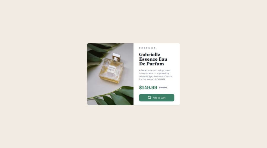
Design comparison
Solution retrospective
The difficulties of this challenge for me is how fit the image inside the box and make it responsive. But by making it as background, replacing and aligning of image becomes easy.
Community feedback
- @hitmorecodePosted 3 months ago
Nice looks good. A few tips
- Don't set the image as background image. Both desktop and mobile version of the page use different images. In this case it's best to make use of the
pictureelement. Just search for "html picture element" and you'll have enough examples on how to use it. - You should do a re-search on semantic html and try to use this approach more when writing html.
I hope you find this helpful. Keep it up👌👍
Marked as helpful0 - Don't set the image as background image. Both desktop and mobile version of the page use different images. In this case it's best to make use of the
- @vb8146649Posted 3 months ago
This looks good , but the site isnt responsive and clips after certain width limit is reached and dont use margin in component else you should use padding for the body tag . Use <s> </s> tag to strike-through a text ,it may look the same but the screen readers and other accessibility software wouldn't announce the price is strike-through and will confuse the buyers as to why there are 2 prices .
Marked as helpful0@Otep02Posted 3 months ago@vb8146649 this is noted sir, thank you so much for the suggestion.
0@Otep02Posted 3 months ago@vb8146649 this is noted sir, thank you so much for the suggestion.
0@Otep02Posted 3 months ago@vb8146649 this is noted sir, thank you so much for the suggestion.
0@Otep02Posted 3 months ago@vb8146649 this is noted sir, thank you so much for the suggestion.
0
Please log in to post a comment
Log in with GitHubJoin our Discord community
Join thousands of Frontend Mentor community members taking the challenges, sharing resources, helping each other, and chatting about all things front-end!
Join our Discord
