

Design comparison

Community feedback
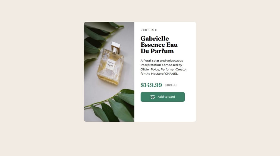
- P@tcaturani-gossPosted 4 months ago
Great job on this code, Aman! If there are a couple of things I could recommend, I would.
-
Take the bold CSS style off of your second paragraph element in the div container with the id of "content" and give it a font- weight of 400.
-
Reduce the #maindiv containers height to 50% or 60% to match the design a little better.
-
Use Flexbox principles on the #content container to center the content in the middle of the container by adding a display of flex, flex-direction column, justify-content center, and align-items center.
Try to use class="" for design changes in your CSS and id="" for JavaScript functionality so when you're incorporating more JavaScript into your websites, you won't get confused and break your code.
You're doing a great job so far, Aman. Keep at it!
0 -

Please log in to post a comment
Log in with GitHubJoin our Discord community
Join thousands of Frontend Mentor community members taking the challenges, sharing resources, helping each other, and chatting about all things front-end!
Join our Discord