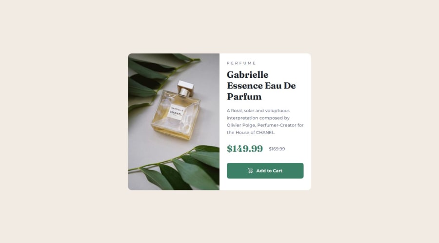
Product Preview Card


Design comparison

Solution retrospective
I'm really happy with the responsiveness of this solution. Next time, I need to study the designs more closely, as I almost forgot to add the hover state - the darker colour wasn't listed in the style guide, so I almost forgot about it until I was re-reading the challenge requirements and it mentioned hover state.
What challenges did you encounter, and how did you overcome them?Initially I was using flexbox for a responsive approach, but once I had implemented the mobile design I realised that grid was better for this solution's layout. I probably could have powered through and made it work with flexbox, but in retrospect if I had been more considerate from the start grid was the obvious solution.
Community feedback
- @skyv26Posted 3 months ago
Hi @Theosaurus-Rex,
I have a suggestion regarding your layout. 😊
- Adding
min-h-screento your<body>element will ensure that your content is vertically centered on the screen. It forces the body to take at least the full height of the viewport, making the content appear in the middle even on larger screens.
Here's how you can modify it:
<body class="font-montserrat bg-primary-cream flex items-center justify-center flex-col min-h-screen">This small tweak will improve the positioning of your content and enhance the user experience. 👍
Let me know if you need further clarification or have more questions! 😄
Marked as helpful1P@Theosaurus-RexPosted 3 months ago@skyv26 Thank you for the feedback! I'll add that in now :)
1 - Adding

Please log in to post a comment
Log in with GitHub
Join our Discord community
Join thousands of Frontend Mentor community members taking the challenges, sharing resources, helping each other, and chatting about all things front-end!
Join our Discord