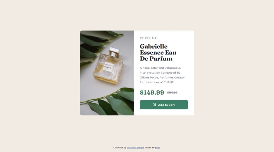


Design comparison

Solution retrospective
Perseverance, of course I've countered some problems but didn't let myself down, kept looking for solution until I was happy with the result.
Using BEM is new to me and I enjoy using it. It does make thing easer in the long run...especially for more complex project.
What challenges did you encounter, and how did you overcome them?The biggest challenge for me was to figure out why the mobile image wasn't loading correctly. It was new to me to have 2 different images to load on different screen sizes, nothing to complicated but I needed to do my research to see what was going on. Firefox DevTool is great, getting to know more about it, it really helped.
I've notice that sometimes small typo errors make me waste so much time until I figure out that it was just a misspell.
What specific areas of your project would you like help with?FEEDBACKS are welcomed!!
Just starting now to use the BEM methodology, so any comment on that is appreciated.
Sometimes I get I a bit confused on how many section in the html structure do I really need to make it work. This time I end up deleting one of them that just wasn't doing anything. I kind of feel I rap thing into things, just a little too much. I'm working on that, feedbacks are welcomed here as well.
!IMPORTANT this time the Figma file didn't have many information, only color and text sizes. I feel like it hasn't been very helpful. I eyeball everything, sizes and paddings, margins and so on
Happy Coding everyone!!
Community feedback
- P@RahexxPosted 4 months ago
Good work with this challenge! It's great that you didn't give up and managed to do such a great job after all. It's awesome that you're using new techniques like BEM, and you could also learn how to change images for different screen sizes. After all, these challenges are meant to help you use different tools and learn along the way.
Here’s some feedback:
-
Great job using BEM! You've implemented it really well. This will definitely be helpful, especially when you start using SASS or LESS. Your class names are clear and precise, just as they should be, so keep up the good work!
-
Regarding sections: you’ve used them as needed, but be careful not to add unnecessary sections, as this might create problems with styling. Generally, keeping things simple will make them easier to style. If you assumed that some sections were unnecessary because they didn’t serve a purpose, that was a great choice. In these situations, think about whether the section is needed and if it actually adds value or just adds complexity.
-
Good work with custom-properties! You even organized them based on use cases, which makes your code clean. I'd suggest adding properties for font-size, spacing (margin, padding), and font-weight as well.
-
In my opinion, I'd place your "utility classes" next to the original classes. This way, all the styles are in one place, and you won’t have to scroll between different sections.
-
Great job using media queries! However, I recommend adopting a mobile-first approach. I highly recommend checking out CSS-Tricks, as they have a wealth of knowledge: CSS-Tricks - Mobile First. It’s easier to design for smaller devices first and then add styles for larger screens. This approach helps avoid many problems when dealing with more complex designs.
-
Finally, you can explore libraries like Bootstrap - Breakpoints or [Tailwind - Responsive Design], and this article: BrowserStack - What are CSS Breakpoints and Media Query Breakpoints. These resources should be helpful for future challenges.
Good job and happy coding!
Marked as helpful0 -

Please log in to post a comment
Log in with GitHub
Join our Discord community
Join thousands of Frontend Mentor community members taking the challenges, sharing resources, helping each other, and chatting about all things front-end!
Join our Discord