Pricing Component with Toggle [Vanilla JS] + SASS + Mobile First
Design comparison
Solution retrospective
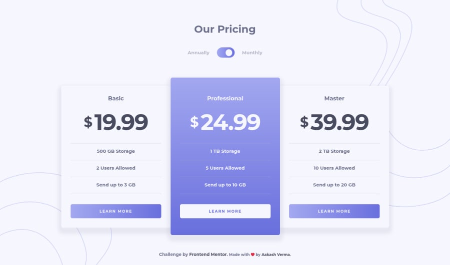
Hi! Really good and easy challenge, I tried to make it pixel perfect but I am happy with final output and I would like to get feedback, suggestion for any kind of improvement. Even I made it accessible. Let me know what you think
Community feedback
- @FarisPalayiPosted about 3 years ago
Nicely done 👌
In addition to what @minimalsm said, my suggestion would be to make the toggle button accessible for keyboard users. Because, currently, the toggle button is not focusable.
For that, instead of using
dispaly: none;to hide the checkbox from the screen, I'd suggest using something likeopacity: 0; height: 1px; width: 1px;(like an.sr-onlyclass). So that the checkbox is still there in the DOM, but users won't be able to see it. Then you can simply add the focus styles when the checkbox is focused. For eg:.checkbox:focus ~ .toggle-btn { outline: solid 2px white; }. You might need to change your markup a bit for this to work, though.Hope it's all understandable :)
Marked as helpful3@skyv26Posted about 3 years ago@FarisPalayi Thank You, Actually I am learning, I do not know much about accessibility, but slowly I will make progress, now I changes my code and it is now focusable and accessible with keyboard.
1@FarisPalayiPosted about 3 years ago@skyv26 You are using tabindexes to make the elements focusable, you shouldn't be using tabindexes on elements that are not already interactive. I get why you used it for this purpose, because, I was also someone who used it without knowing its effect on accessibility. It's one of those things that you only should use if you absolutely have to. It's glad to know that you are learning accessibility. Because, it's neglected by a lot of developers.
Here are some resources that helped me when I was first getting into accessibility. Free accessibility course by Google, Web accessibility - MDN, Accessibility - W3C.
Also, I'm not an expert in this thing or anything, I'm also someone who is learning accessibility. Have fun learning and coding ✨
Marked as helpful1@skyv26Posted about 3 years ago@FarisPalayi Thank You ! But can please tell me what should I use instead of tab-indexes ?
0 - @minimalsmPosted about 3 years ago
Hey @skyv26, this looks great 😀
A few things I'd change
-
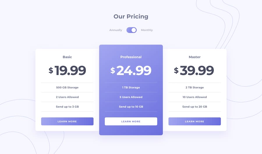
- Your whites are getting washed out by the background-color (#F6F6FD). I think the design calls for using pure white (#FFF).
-
- You have some inconsistent spacing in your markup (e.g. double space here:
<article class="article article-2">) which could use cleaning up.
- You have some inconsistent spacing in your markup (e.g. double space here:
-
- The toggle button's circle should be larger to match the design.
Marked as helpful2 -
- @Tomi-pterPosted about 3 years ago
Looks good. You forgot to add the hover states for the buttons and the toggle button.
As for making the toggle button work with the keyboard I used the
onkeyupevent listener ande.key === 'Enter'to enable that functionality.Hope this helps 👍🏾
Marked as helpful1 - @anoshaahmedPosted about 3 years ago
You did really good. For box shadow you did:
0 10px 10px -1px rgb(109 112 141 / 10%)but i think if you change the last value to -1px, it would be a bit closer to what the design is. likebox-shadow: 0 10px 10px -1px rgb(109 112 141 / 10%)Marked as helpful1
Please log in to post a comment
Log in with GitHubJoin our Discord community
Join thousands of Frontend Mentor community members taking the challenges, sharing resources, helping each other, and chatting about all things front-end!
Join our Discord
