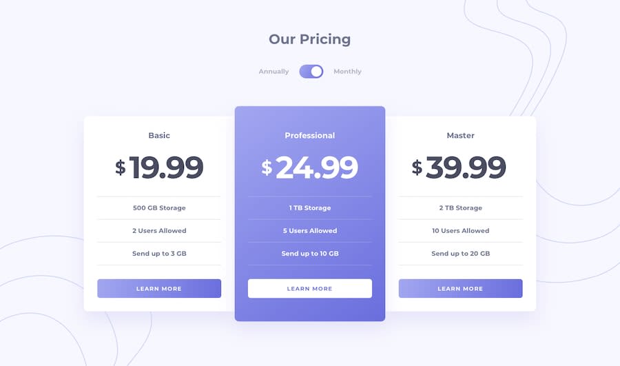
Pricing component with toggle => input, toggle, special card
Design comparison
Solution retrospective
I would appreciate any feedback, thank you in advance.
Community feedback
- Account deleted
Hi, that looks pretty impressive. Good work! I have two things to add. First give the buttons an :active state so the user can see if it was indeed clicked. And a small error occurs on 800px. When i switch pricing I also change the width of the card elements. That happens due to the change of to digits to three digits. That is no real error but brings a strange probably unwanted design effect.
happy coding :)
Marked as helpful0@VaNaChiMaPosted about 3 years ago@shantam8 Hi, thanks! I will improve these moments. 36 projects = > wow! Greate! Good luck!
0 - @Dharmik48Posted about 3 years ago
Hey👋,
Your solution is really good! It looks really nice! But some things you should improve on:
- It is a really good practice to use units like
emandreminstead ofpxso you should start using them. Also use semantic HTML tags likemain,section,header, etc. instead ofdivseverywhere. - And very minor thing is that you can add some transition to hover states to improve the experience of the user
Keep it Up👍🤗
0 - It is a really good practice to use units like
Please log in to post a comment
Log in with GitHubJoin our Discord community
Join thousands of Frontend Mentor community members taking the challenges, sharing resources, helping each other, and chatting about all things front-end!
Join our Discord

