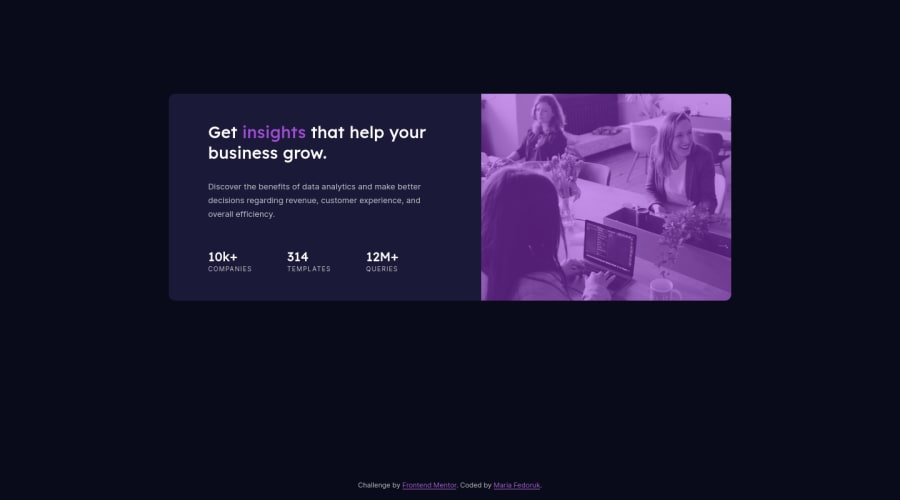
Preview card using HTML/CSS, mobile & desktop on flexbox
Design comparison
Solution retrospective
Hi there 👋 For this challenge, I focused fully on using flexbox on both mobile and desktop – instead of a combo of flexbox (mobile) and grid (desktop) like I usually do. It helped to think more on how to re-use the structure which was set first for mobile, and get familiar with more features of flexbox.
Any feedback – let me know, super happy to hear any pointers on how to improve my code 🙌
Community feedback
- @tedikoPosted over 3 years ago
Hello, Maria! 👋
Good job on finishing another challenge! What I can suggest you is:
- Since you're using Flexbox there is no need to position your
.preview-cardelement withtopproperty. You used correctlyjustify-content: centeron your body which should center your flex container along the main-axis. The reason why it doesn't work is that you didn't setheighton your body. Set it tomin-width: 100vhfor example and your container will be centered. Don't forget to removetopstyles from.preview-card.
Good luck with that, have fun coding! 💪
1@itsfedorukPosted over 3 years agoHi Tediko, thank you for checking out my code! Yes, and I was wondering why my card wasn't being centered properly 😬
I just tried it out again, and it worked for me with
height: 100vh. Thanks for the tip!0 - Since you're using Flexbox there is no need to position your
- @josuke0227Posted over 3 years ago
Hello, Maria.
I like your clean BEM notation for the class names👍!
I'd like to suggest you one thing. You can use "rem" or "em" unit for font-size instead of "px". This is because the display of these day has high density, it can display 1000px even if its width is 500px. "px" unit may cause your text size shrink when it is displayed.
Also "rem" and "em" unit works well when someone👵👴 changed the text size from your browser's setting!
Happy coding! 😁
1@itsfedorukPosted over 3 years agoHi Josuke, thank you for your comment ☺️ Appreciate the advice, I'll keep this in mind and already changed it in the solution. And indeed, it would be so much better for accessibility.
Btw, I checked your solution out – love the animation touch on the stats numbers!
1
Please log in to post a comment
Log in with GitHubJoin our Discord community
Join thousands of Frontend Mentor community members taking the challenges, sharing resources, helping each other, and chatting about all things front-end!
Join our Discord
