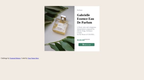
Not Found
Not Found
Not Found
Not Found
Not Found
Not Found
Not Found
Not Found
Not Found
Not Found
Not Found
Not Found
Not Found
Not Found
Not Found
Not Found
Not Found
Not Found
Not Found
Not Found

Submitted

Preview card

Big-Norj 100

@Kingnorj1

Desktop design screenshot for the Product preview card component coding challenge

This is a solution for...

  • HTML
  • CSS
1newbie
View challenge

Design comparison


SolutionDesign

Solution retrospective


Not responsive at the moment! i will learn Css position and media query today! YOUR FEEDBACK IS WELCOMED

Community feedback

@anthonyplicata

Posted

I just did this challenge as well. What I learned to make it responsive was using flexbox and grid. I used a <picture> element that lets you have an <img> and <source srcset=""> so the browser can use both images depending on the screen size. w3schools.com helps me a whole lot.

Marked as helpful

0
hitmorecode 6,230

@hitmorecode

Posted

Nice try, but it's far from complete. Don't learn just position and media query, there is more to it. My advise is get yourself familiar with flexbox and css grid. This in combination with media query will be more useful in the long run. This doesn't mean you should not learn position, yes throw position also in the mix.

Marked as helpful

0

Please log in to post a comment

Log in with GitHub
Discord logo

Join our Discord community

Join thousands of Frontend Mentor community members taking the challenges, sharing resources, helping each other, and chatting about all things front-end!

Join our Discord