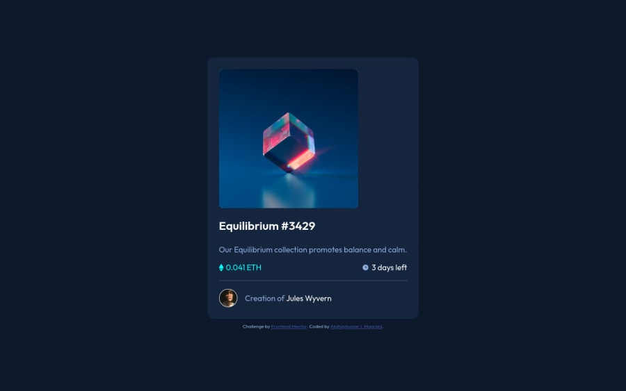
Design comparison
Community feedback
- @grace-snowPosted about 3 years ago
I can confirm this is spilling off the screen on my phone.
You also need to change the html on this. I can see you're trying to use semantic elements, but using header and footer in this kind of component can actually damage accessibility rather than help it. It could work better if you'd used article instead of section but I still think it's unnecessary
The most important html structure for accessibility is headings, followed by using the right kind of interactive elements where required
That brings up the next important html issue. This is missing anchor tags for wherever there are hover styles. Those elements will then need focus visible styles too, once they've been made interactive
Read up on how and when to write alt text on images and how to make inline svgs accessible. They'll either need aria-hidden if meaningless or labelling appropriately if meaningful.
Good luck
Marked as helpful1 - @vanzasetiaPosted about 3 years ago
👋 Hi Akshay!
🎉 Congratulations on finishing this challenge!
Like Grace and Ricardo have mentioned about the overflowing issue on small screen size, I would recommend adding
paddingto thebodyelement to prevent the card fill the entire page on mobile view.Some feedback from me:
- Accessibility
- All elements that have
:hoveror:activestates should be interactive elements, which in this case they should link elements. It is also recommended by me to create a custom:focus-visiblestyling to any interactive elements (button, links,input,textarea). This will make the users can navigate this website using keyboard (Tab) easily. - Always wrap text content with meaningful tag (
p).spananddivshould only be used for styling purposes. - Read this tutorial from W3 WAI about images. It will teach you how to write a meaningful alternative text and a lot of stuff about images. Also, I recommend reading this ultimate guide about the alternative text by Axess Lab.
- Your
attributionshould be thefooter(not the content inside the card). - Use
remor sometimesemunit instead ofpx(especially font size). Usingpxwill not allow the users to control the size of the page based on their needs.
- All elements that have
- Best Practice (Recommended)
- Put all the styling on a separate stylesheet. The presentation (HTML) and the styling should be separated.
- Styling
- I would recommend making the
bodyelement as a flexbox container to make the card in the middle of the page. It's much simpler than using the absolute positioning method.
- I would recommend making the
/**
 * 1. Make the card vertically center and
 *      allow the body element to grow if
 *      needed
 */
body {
  display: flex;
  align-items: center;
  justify-content: center;
  min-height: 100vh; /* 1 */
}
That's it! Hopefully, this is helpful!
Marked as helpful0@akshaymagraniPosted about 3 years ago@vanzasetia, Thank you for your feedback and suggestions. I will surely implement them in my solution. Making 'body element a flexbox is very helpful. I will be updating the solution. Hope to hear from you then.
0@vanzasetiaPosted about 3 years ago@akshaymagrani You're welcome! If you find the feedback is helpful, please mark it as helpful. Thanks!
0 - Accessibility
- @AmodeusRPosted about 3 years ago
You need to work on your mobile version! It's broken.
0@akshaymagraniPosted about 3 years ago@AmodeusR Thank you for your feedback. Actually, it looks fine on my screen, when I reduce the viewport. Also, I corrected the HTML issues but the same does not update when I request to generate a new report.
0@AmodeusRPosted about 3 years ago@akshaymagrani Are you referring to the 320px or 375px mobile width? It works reasonably well till 375px width – could just have some margins from the screen boundaries –, But it leaks out when smaller than 375px width.
0
Please log in to post a comment
Log in with GitHubJoin our Discord community
Join thousands of Frontend Mentor community members taking the challenges, sharing resources, helping each other, and chatting about all things front-end!
Join our Discord
